

Jagdish Farshan
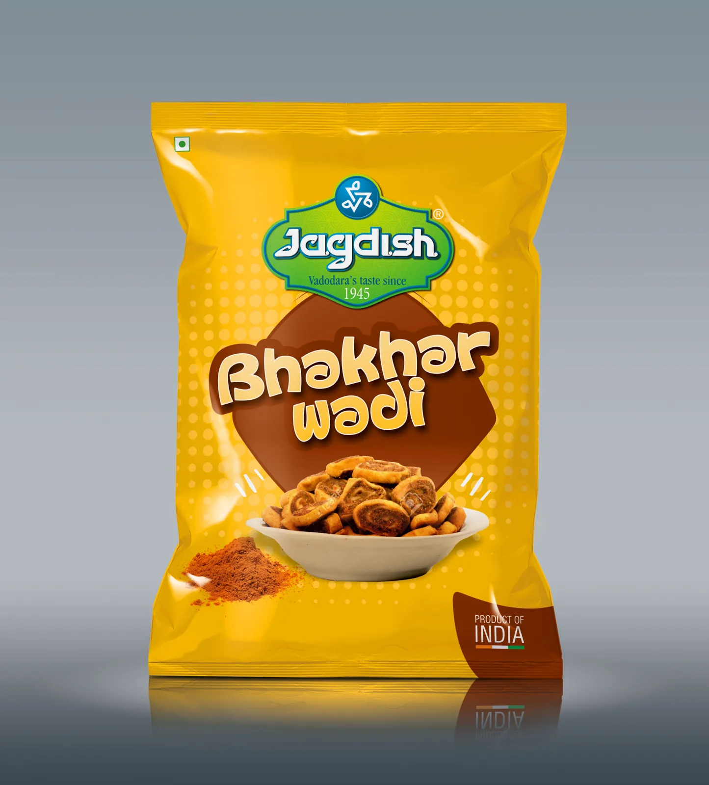
FMCG packaging redesign and brand identity strategy for Jagdish Farshan
Snacks
- Packaging
The Premise
Preserving generational trust while winning modern shelves.
Jagdish Farshan is a household heritage brand with decades of deep-rooted customer loyalty across Gujarat. As the brand expanded into modern trade outlets, regional retail networks, and quick-commerce platforms, its packaging needed to modernize without diluting the authentic taste and nostalgia that loyal customers expect.
The Tension
Nostalgia retains loyal buyers.
Modern visual design captures new markets.
Legacy food brands often face a critical dilemma during expansion: radical redesigns risk alienating lifetime customers, while minor tweaks fail to catch the eye of younger shoppers on crowded retail shelves. Nu.sense reframed Jagdish Farshan’s visual system to strike a harmonious balance between heritage authenticity and contemporary retail appeal.
The Real Problem
The three challenges facing heritage food brands in modern retail.
- The Heritage Dilution Risk. Evolving the visual identity without losing the recognizable visual markers built over generations.
- Range Architecture Clutter. Inconsistent colors and typography across a sprawling portfolio of sweets, namkeens, and dry snacks.
- Quick-Commerce Thumbnail Bleed. Packaging graphics fading into the background on small 100px mobile app screens like Blinkit and Instamart.
The Solution & Execution
Thoughtful heritage evolution meets shelf-ready architecture.
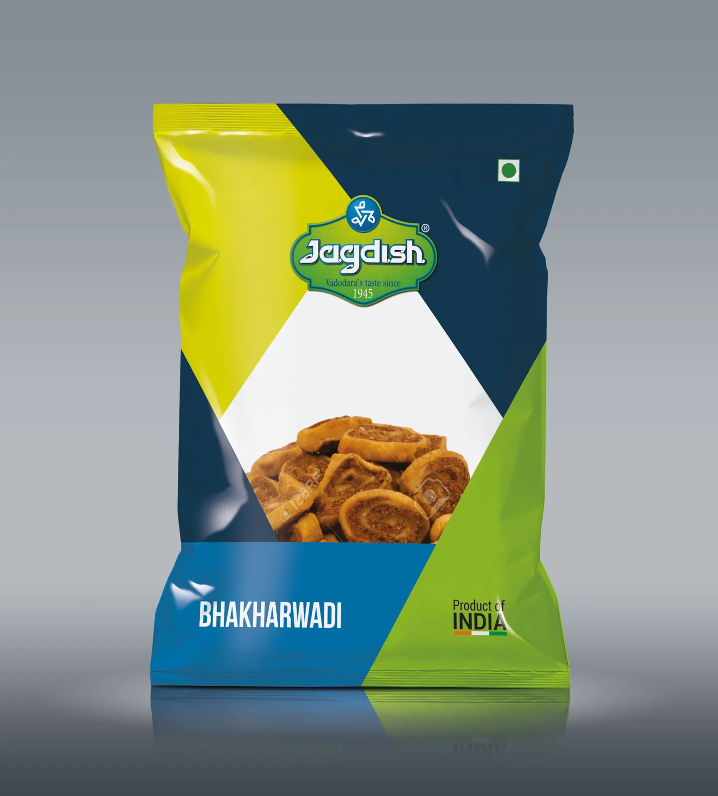
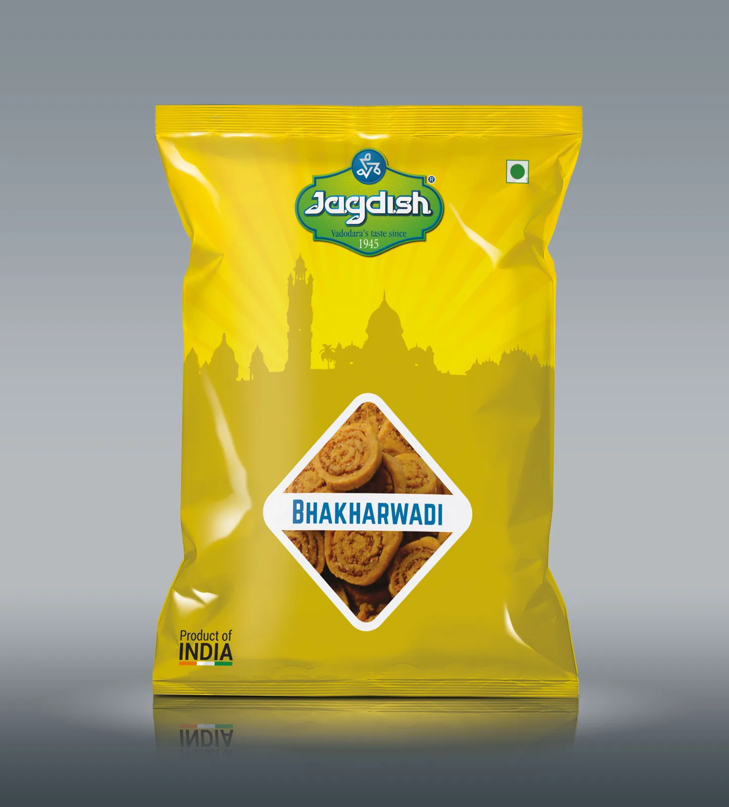
- Visual Identity Refresh. Redesigned the iconic mark with refined geometric precision while retaining core heritage elements and traditional colors.
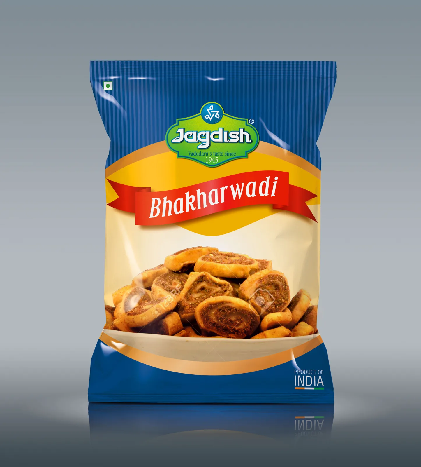
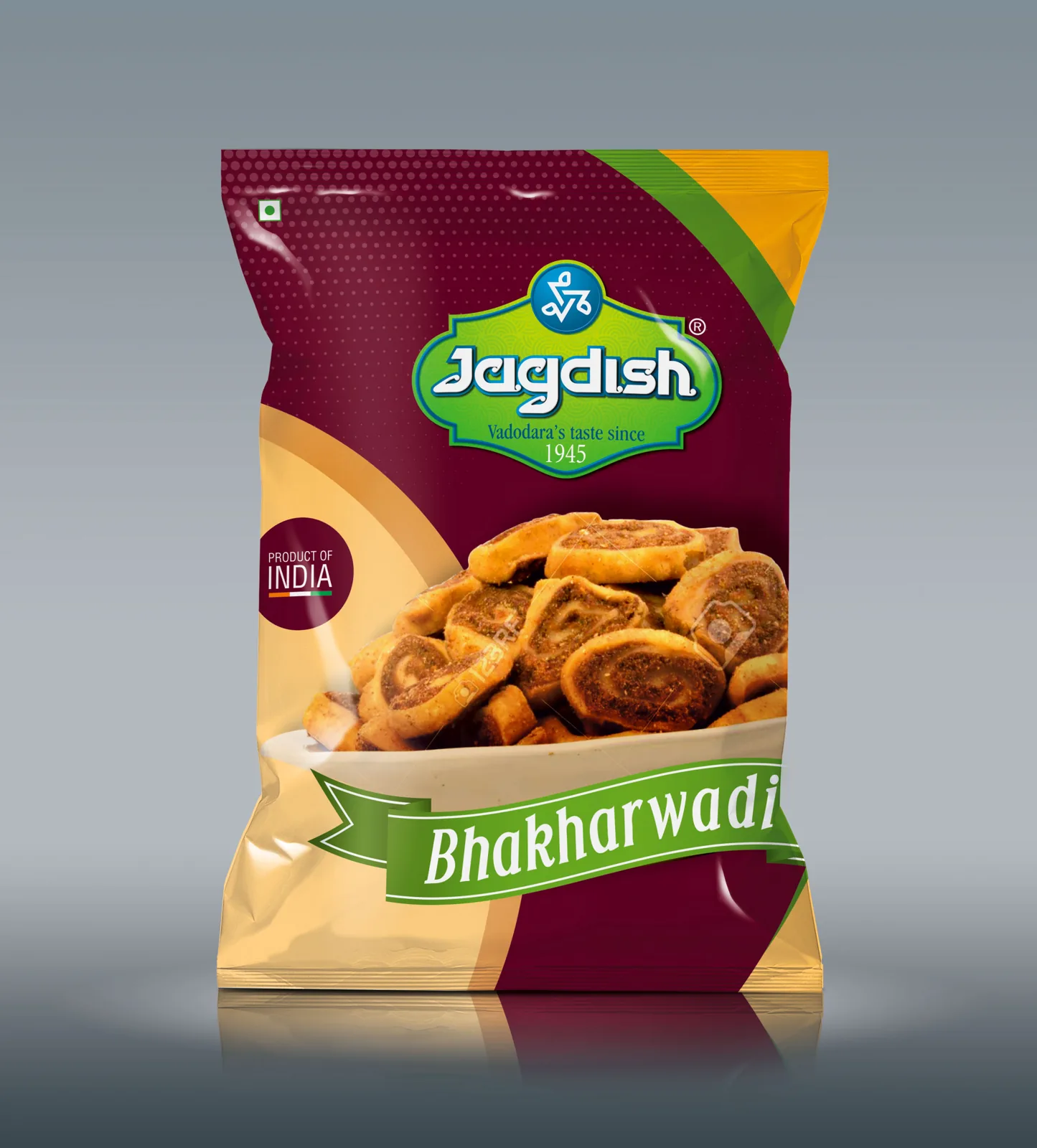
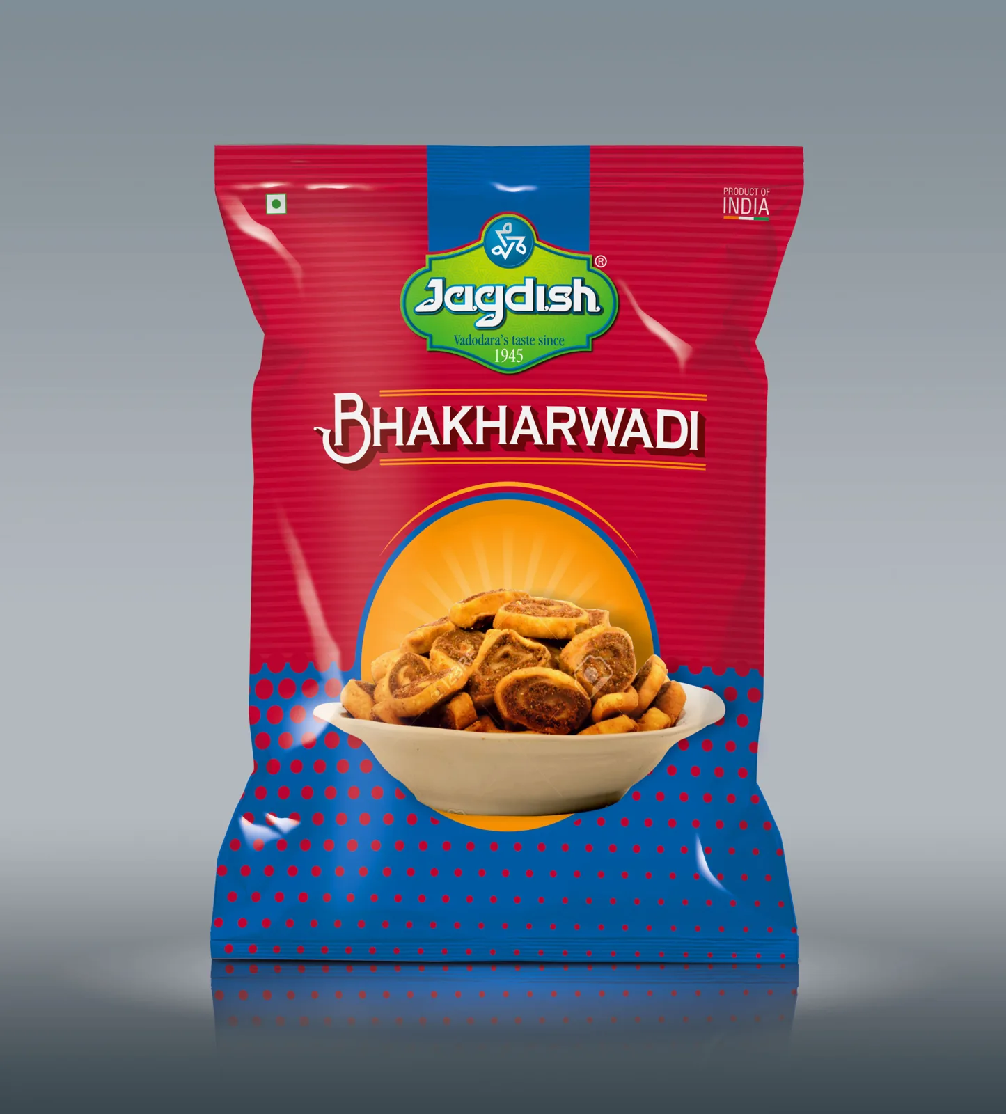
- Packaging Range System. Created a color-coded visual hierarchy across product categories (namkeen, sweets, festival specials), making range selection effortless for shoppers.
- FSSAI & Quick-Commerce Ready. Standardized compliant typography, food-grade pouch material specs, and high-contrast digital thumbnail assets optimized for both physical store shelves and app listings.
The Outcome
Modernized visual presence. Seamless retail transition.
- Successfully rolled out modernized packaging across regional supermarkets, retail stores, and online quick-commerce platforms.
- Strengthened brand recognition and product shelf presence across both traditional and contemporary trade channels.
Next Project
Nirmal