

Nirmal
Spice packaging design and product communication for Nirmal by Nu.sense Brand Lab, Vadodara
Food / Spices
- Packaging
- Product Communication
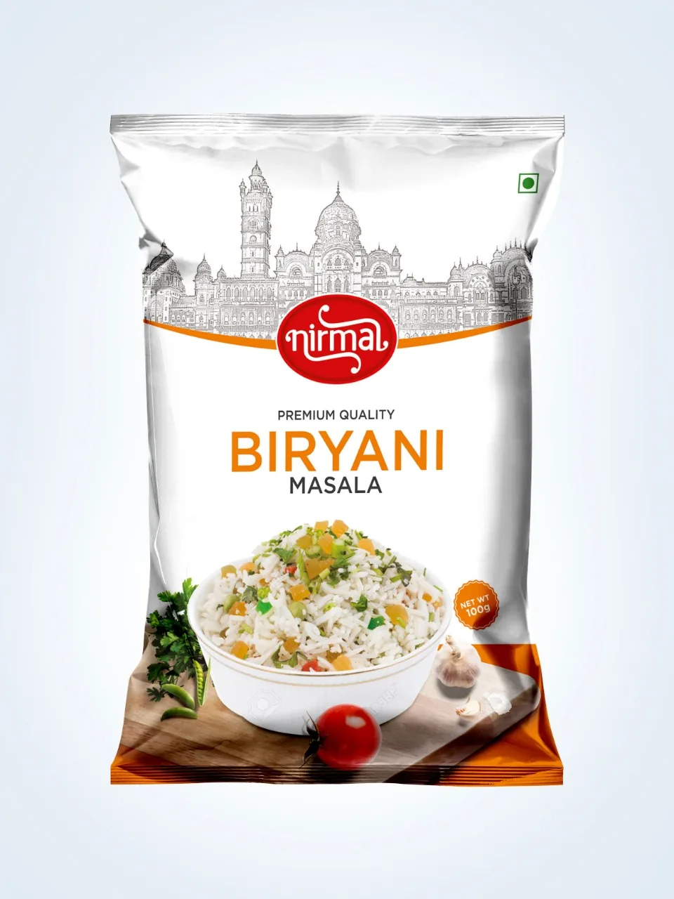
Case Study · Nirmal · Food / Spices
Pure spice. Packed to be picked.
Nirmal had the quality. The pack wasn't saying so. We gave every spice one clear reason to be chosen, then made sure it shows in half a second, on the shelf and on the screen.
Brand Positioning · Packaging & Range Architecture · Product Communication
The context and the problem
Every pack says pure. Few prove it.
The spice aisle is a wall of red, yellow and promises.
Turmeric, chilli, coriander, garam masala. Most brands in the aisle use the same colours, the same steaming bowls and the same claims. To a shopper, they blur into one wall.
Nirmal came to our branding agency in Vadodara with a product families already trust in their kitchens. On the shelf, that trust was invisible. The packs looked like everyone else's. On quick commerce apps, the spice names shrank into the grid. And the name itself, which means pure, was doing none of the work.
Good product. Quiet shelf. That was the real problem.
The strategy: Make Sense
The answer was already in the name.
Most brand problems aren't logo problems. Nirmal's wasn't either. Before we drew a single pack, we read the category, the customer and the competition, and found the reason sitting in plain sight.
Nirmal means pure. So purity became the one idea every pack had to prove, not just print.
A shopper decides in half a second. In that time, nobody reads a back panel. They read colour, name and one promise. We set that order for every SKU: brand, spice, proof. Everything else moved to where it is needed, not where it shouts.
Not different for show. Different because sameness doesn't sell.
Nirmal. The pure one.
Packaging and product communication: Make Noise
Half a second. Every spice.
With the reason clear, we built the noise around it. Where the category crowds, Nirmal breathes. Open space and a calm, confident layout let the name stand out by standing still.
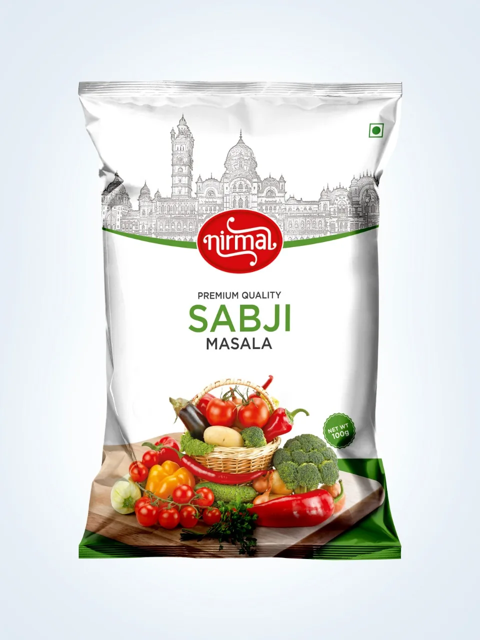
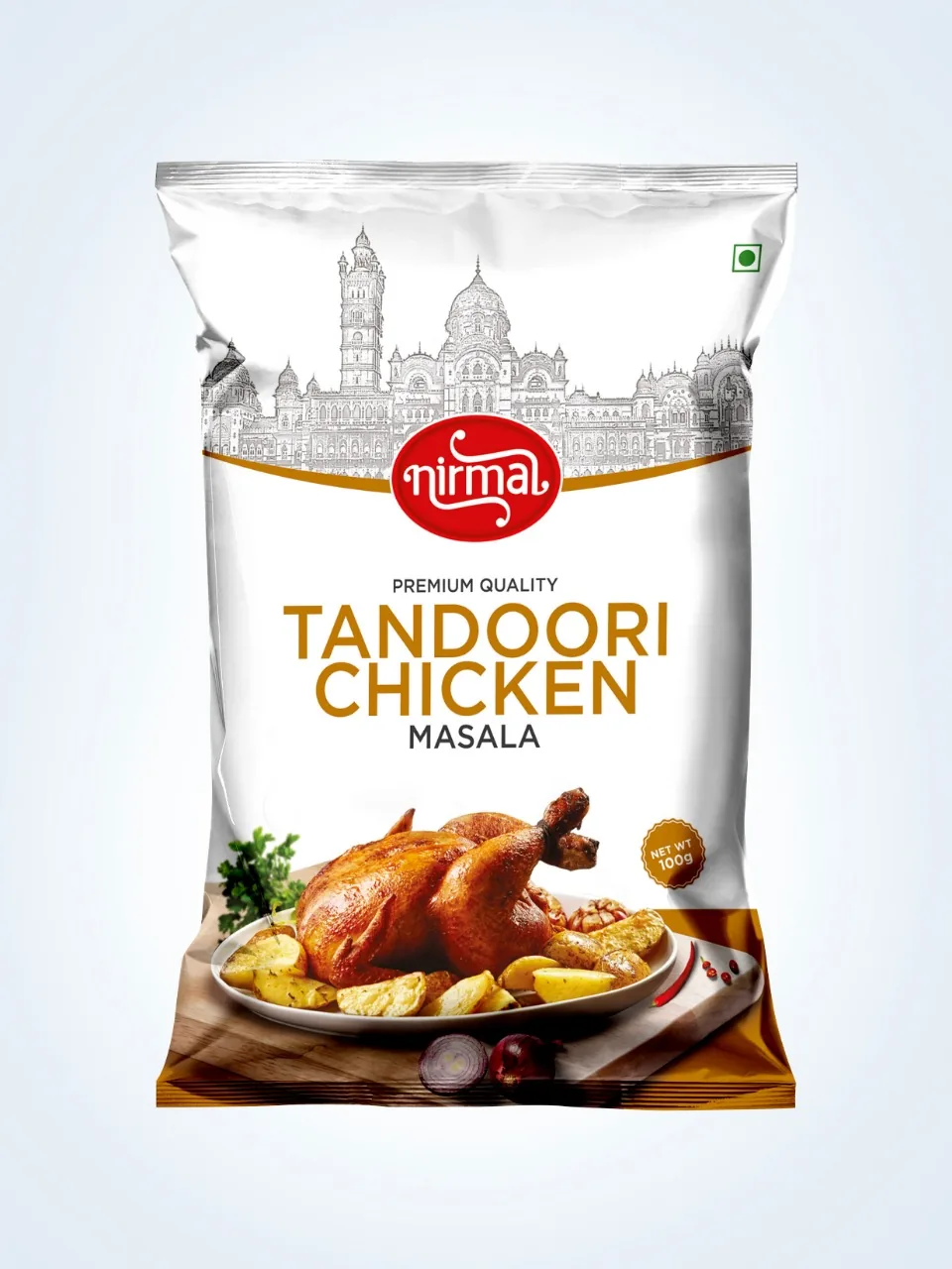
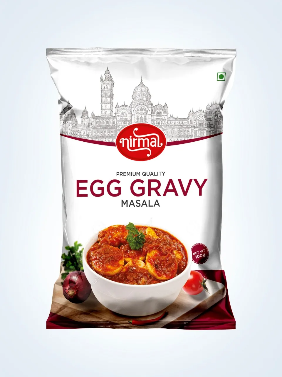
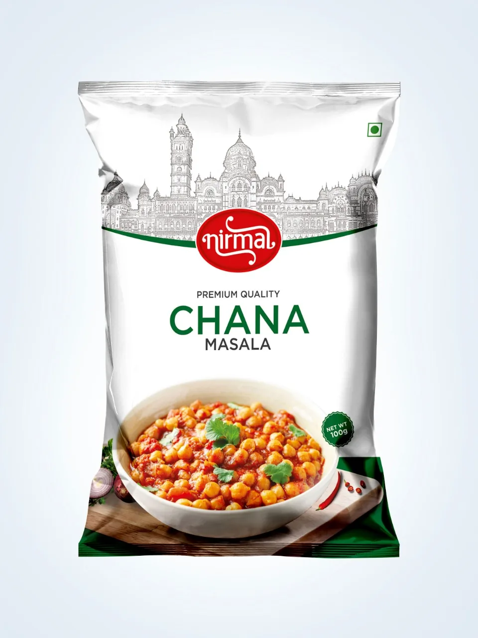
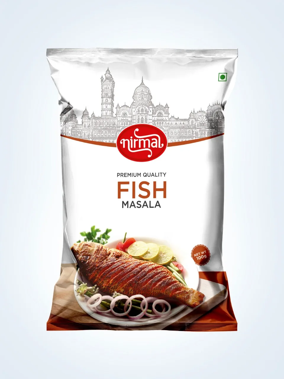
Each spice family carries its own colour code, so a shopper finds chilli or turmeric without reading a word. The product communication speaks plainly: what is inside, how it tastes, why it can be trusted. No borrowed adjectives.
The pack works twice. On a crowded supermarket or kirana shelf, it holds its own from a distance. On Blinkit, Zepto and Instamart, the spice name and variant stay legible at thumbnail size. FSSAI details sit in one clean back panel system across the range, and every SKU was seen through to print.
Project deliverables: What we built
- 01. Brand Positioning. Purity as the single reason to choose, drawn from the name itself.
- 02. Packaging System. One spice packaging design language across the full range, built to scale.
- 03. Range Architecture. Colour coding by spice family for instant navigation on the shelf.
- 04. Product Communication. Front of pack hierarchy and plain language back panel copy, FSSAI-ready.
- 05. Quick Commerce Assets. Thumbnail-first pack fronts for delivery apps and ecommerce listings.
- 06. Print Production. Press-ready artwork, seen through to the finished pack.
The outcome: The proof
Pure. And now it shows.
The market tells us if it worked. Nirmal now reads as one brand across every SKU, from the shelf to the phone screen. The name and the pack finally say the same thing. Shoppers find their spice faster, and the range has room to grow without losing its order.
Every choice on the pack earns its place: the space, the colour, the order of the words.
Pretty is easy. Picked is the job.
Good product, quiet shelf? One page. Straight answers. No obligation.
Get your free brand diagnosis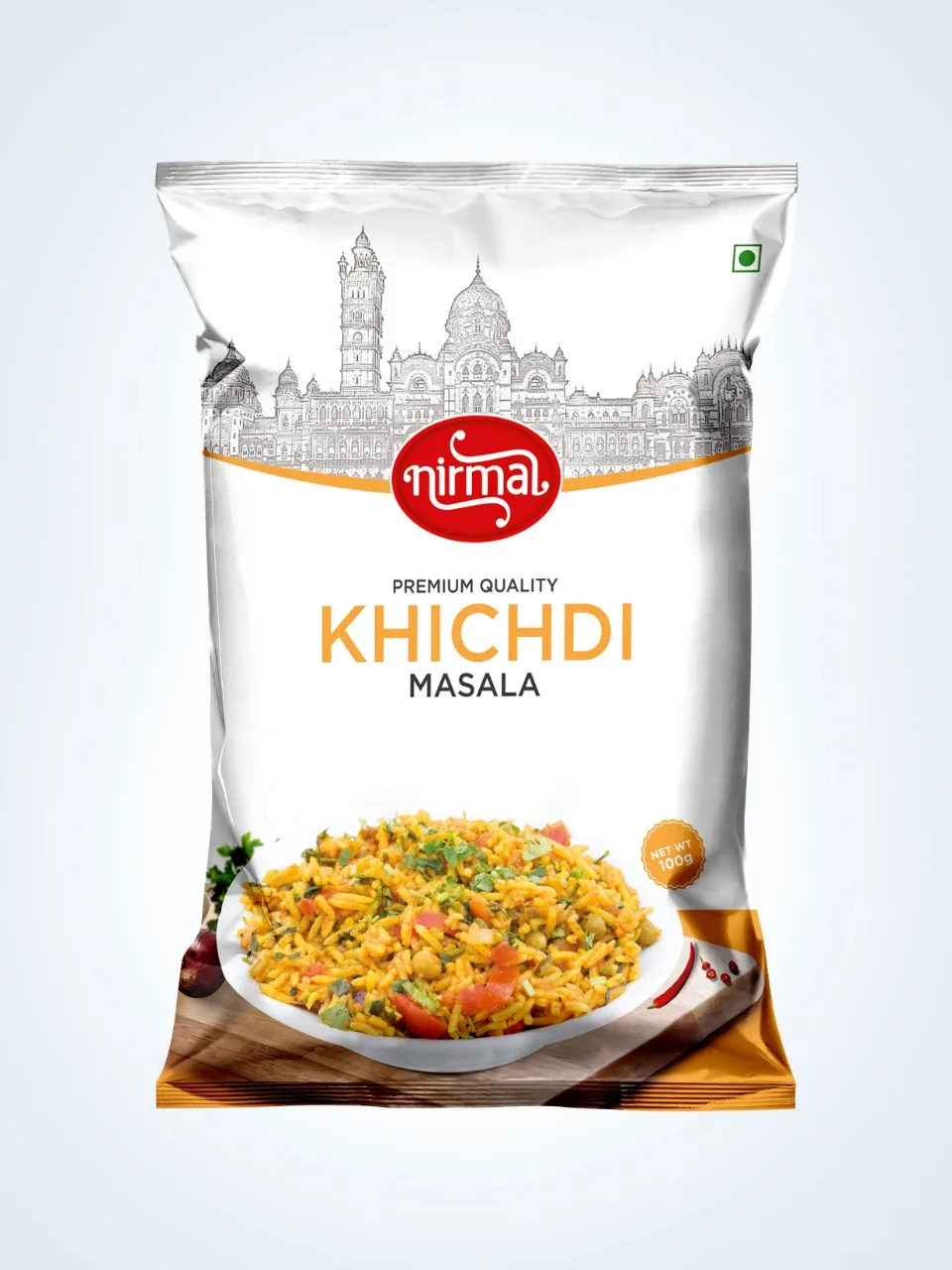
Next Project
Cream & More