

Dhantal
Beverage packaging design and retail branding for Dhantal by Nu.sense Brand Lab, Vadodara
Beverages
- Packaging
- Retail
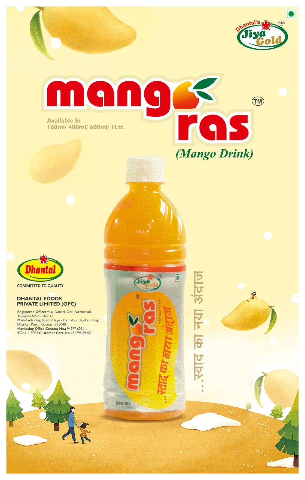
Case Study · Dhantal · Beverages
Three seconds at the cooler. One drink gets picked.
Dhantal had a drink worth reaching for. We gave it one clear reason to be chosen, then made it hard to miss, on the pack, in the cooler and across the store.
Brand Positioning · Packaging Design · Retail Branding
The context and the problem
Thirst is instant. So is the choice.
The beverage aisle doesn't wait for anyone.
Nobody plans which drink they'll buy. A shopper opens the cooler, scans the rows and reaches. The decision takes about as long as the door stays open.
In those seconds, most drinks look alike: bright colours, splashes of fruit, the same loud promises stacked side by side. Big brands win by habit. Everyone else has to win by being seen.
Dhantal came to our branding agency in Vadodara with a good drink and a familiar problem. On the shelf, it was one more bottle in the row. In the store, it had no presence beyond the pack. A strong product was losing the moment that matters most.
The strategy: Make Sense
A name with a beat in it.
Loud gets looked at. Clear gets picked. So before we designed a single label, we read the category, the shopper and the shelf, and asked one question: why should a hand stop at Dhantal?
The answer was in the name. A dhantal is a folk rhythm instrument, simple, joyful and impossible to ignore once it starts. That became the brand's character: a drink with energy and a steady beat, not noise for its own sake.
Rhythm also solved the shelf. One pack is easy to miss. A row of packs that repeat in a strong, steady pattern becomes a block no shopper can scan past.
Dhantal. Feel the beat.
Packaging and retail: Make Noise
One pack. A whole shelf of rhythm.
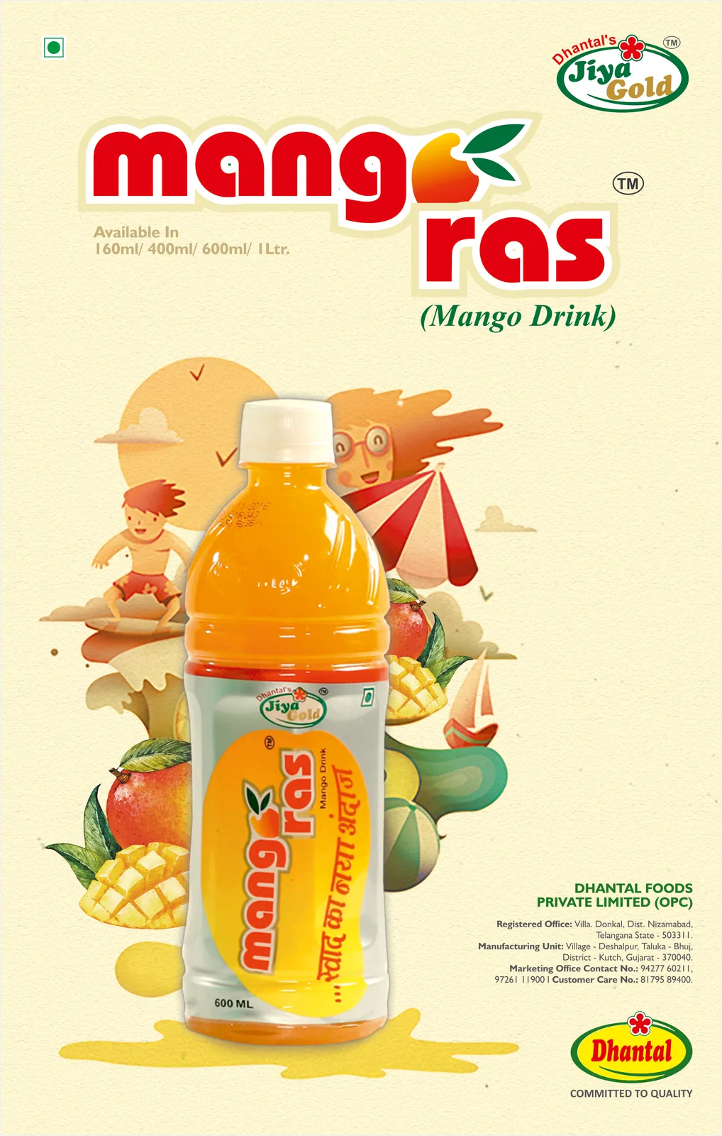
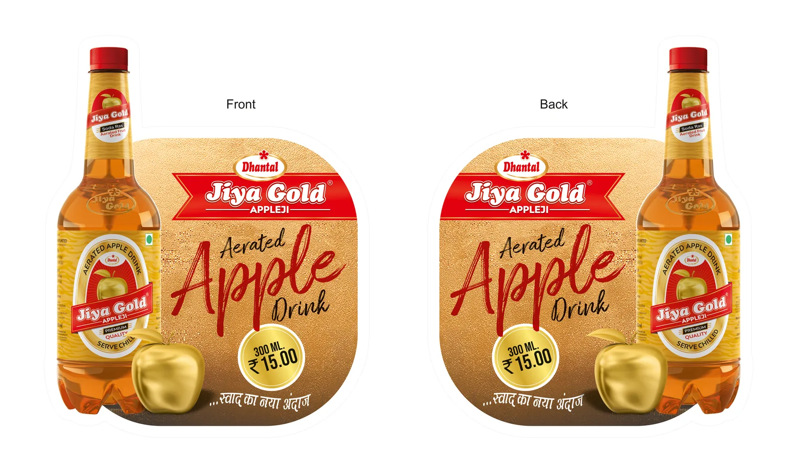
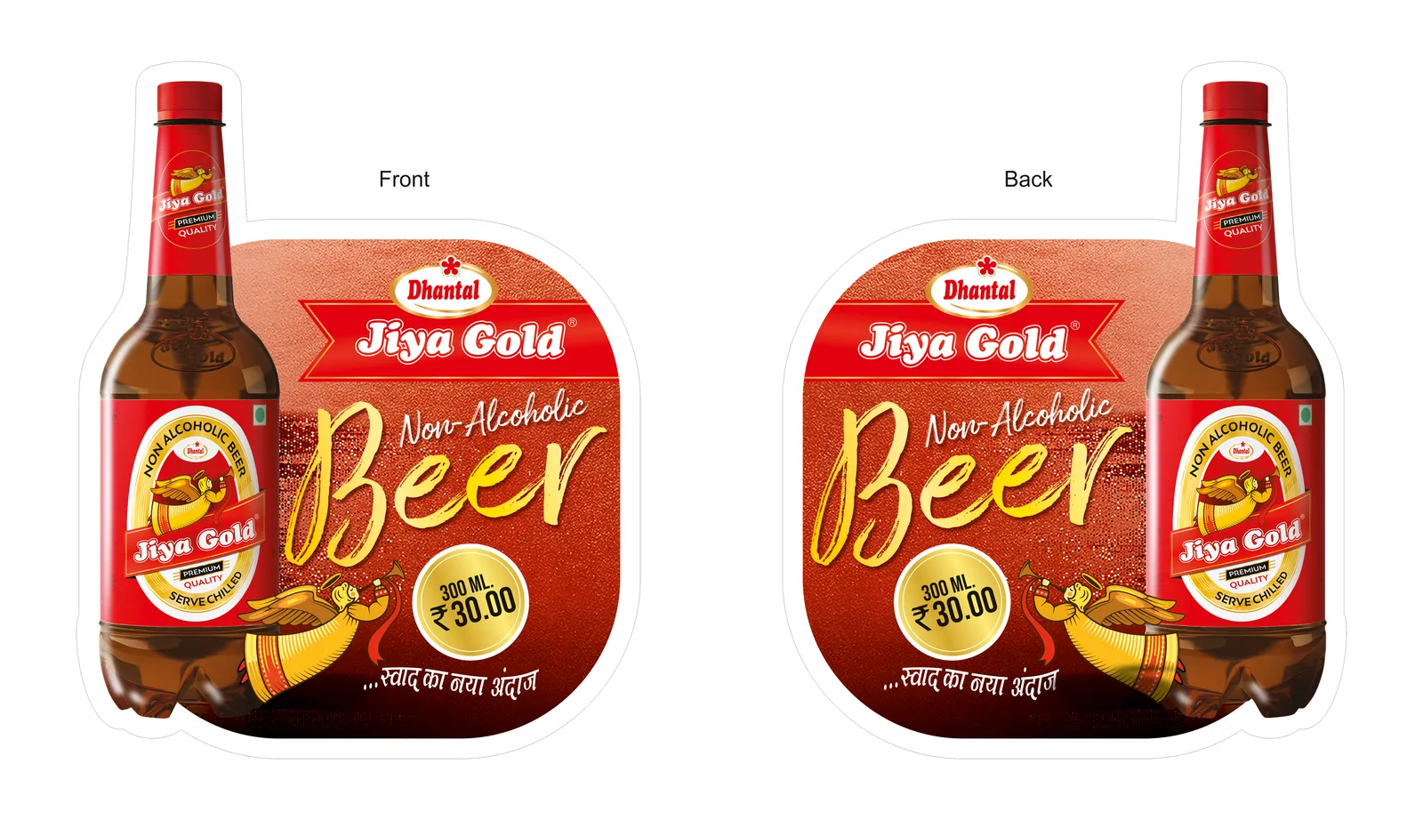
With the reason clear, we made the noise. The packaging design carries a bold, repeating graphic that reads as one unit on a single bottle and as a wall of pattern across a full row. The brand name sits high and large, where the eye lands first through cooler glass.
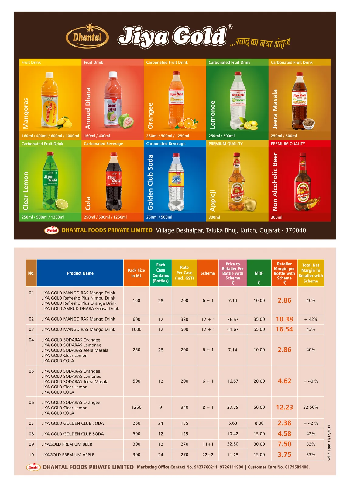
Each flavour holds its own colour within the same beat, so a shopper finds their pick without breaking the rhythm. Front of pack keeps to three things: brand, flavour, one promise. On Blinkit, Zepto and Instamart, the same hierarchy stays legible at thumbnail size.
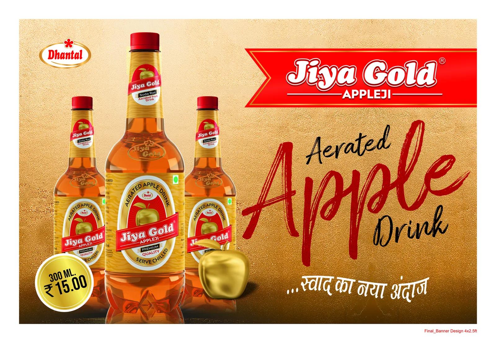
Then we took Dhantal beyond the pack. Cooler branding, shelf strips, counter displays and in-store graphics carry the same pattern, so the brand is seen before the shopper reaches the shelf. The store becomes part of the pack.
Project deliverables: What we built
- 01. Brand Positioning. A clear character for Dhantal, built from the energy of its name.
- 02. Packaging Design. A repeating pack system that builds a brand block on the shelf.
- 03. Flavour Architecture. Colour coding by variant, held within one visual rhythm.
- 04. Quick Commerce Assets. Thumbnail-first pack fronts for delivery apps and ecommerce listings.
- 05. Retail Branding. Cooler branding, shelf strips, counter displays and in-store graphics.
- 06. Print Production. Press-ready artwork, seen through to the finished pack and the store.
The outcome: The proof
Seen before it's searched for.
The market tells us if it worked. Dhantal now shows up as one brand, from the cooler door to the counter to the phone screen. The pack and the store speak in the same beat, and the range has a system ready for every new flavour.
Every choice earns its place: the pattern, the colour, the order of the words.
Pretty is easy. Picked is the job.
Good drink, quiet cooler? One page. Straight answers. No obligation.
Get your free brand diagnosis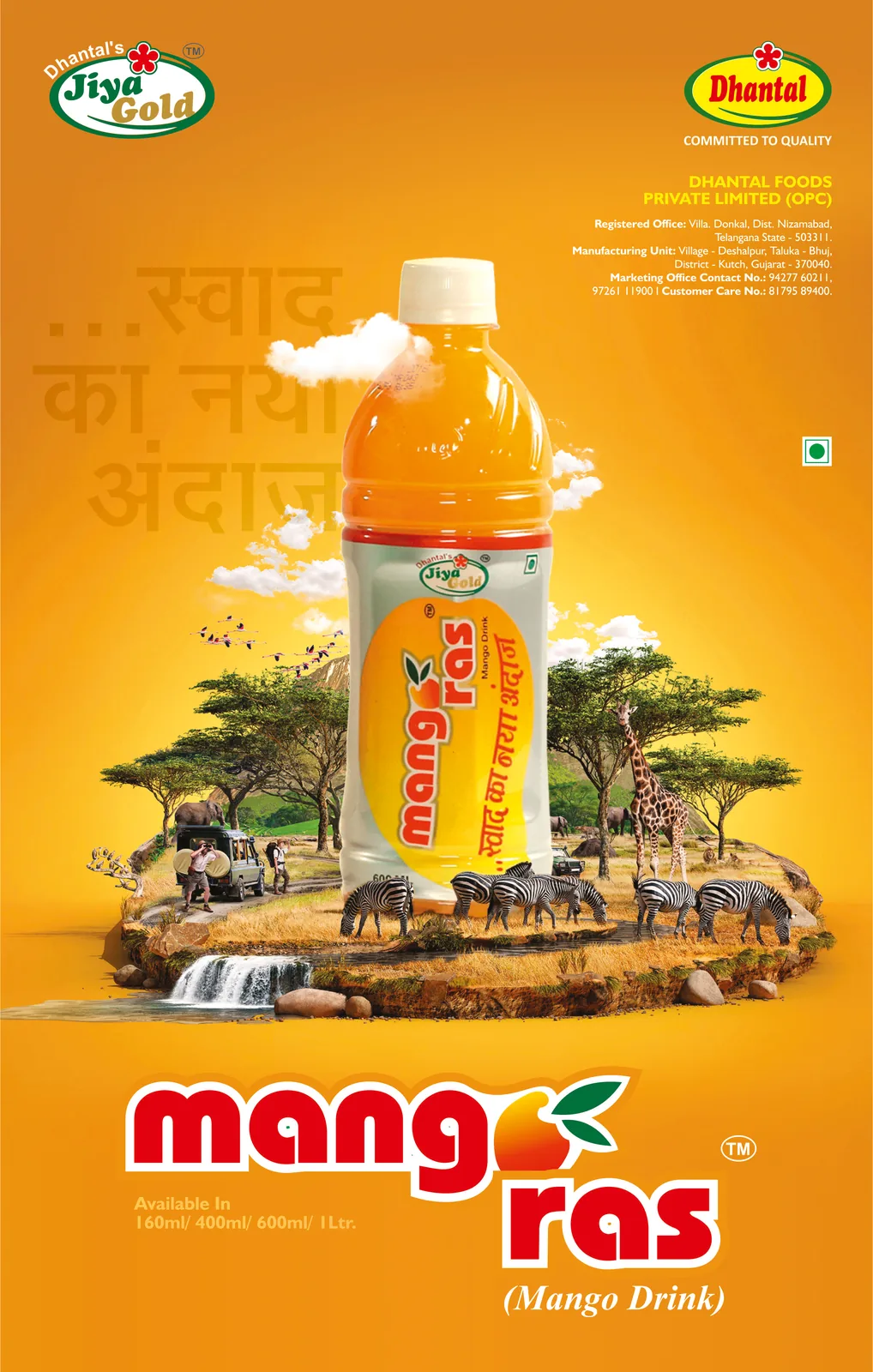
Next Project
Cafe Express