

Cafe Express
Tea and coffee packaging design for Cafe Express by Nu.sense Brand Lab, Vadodara
Tea & Coffee
- Packaging
Case Study · Cafe Express · Tea & Coffee
Quick to find. Worth slowing down for.
Cafe Express makes the cup that starts the day. We gave it one clear reason to be chosen, then built packaging that shows it in half a second, on the shelf and on the screen.
Brand Positioning · Packaging Design · Range Architecture
The context and the problem
Everyone sells aroma. Nobody can smell a pack.
The tea and coffee shelf all looks the same.
Steaming cups. Scattered beans. Tea leaves in soft focus. Walk down any aisle and every brand tells the same story with the same pictures. Shoppers stop seeing them.
The category also asks a pack to do something impossible. People buy tea and coffee for taste and aroma, and a pack can show neither. It has to signal freshness, strength and quality through design alone.
Cafe Express came to our branding agency in Vadodara with a product people enjoy and a pack that wasn't pulling its weight. The name promised speed and energy. The shelf saw one more cup among many.
The strategy: Make Sense
The name is half the brief.
Most brand problems aren't logo problems. Before we designed a single pack, we read the category, the customer and the competition, and listened to the name.
Express means two things at once. It is the speed of a morning that won't wait, and it is a cup with character that says something. We built the brand on both: easy to find, easy to make, and rich enough to be worth the pause.
A shopper decides in half a second, so we set one order for every pack: brand, blend, strength. Everything else moves to where it is needed, not where it shouts.
Cafe Express. Your cup, without the wait.
Packaging: Make Noise
Half a second. Full flavour.
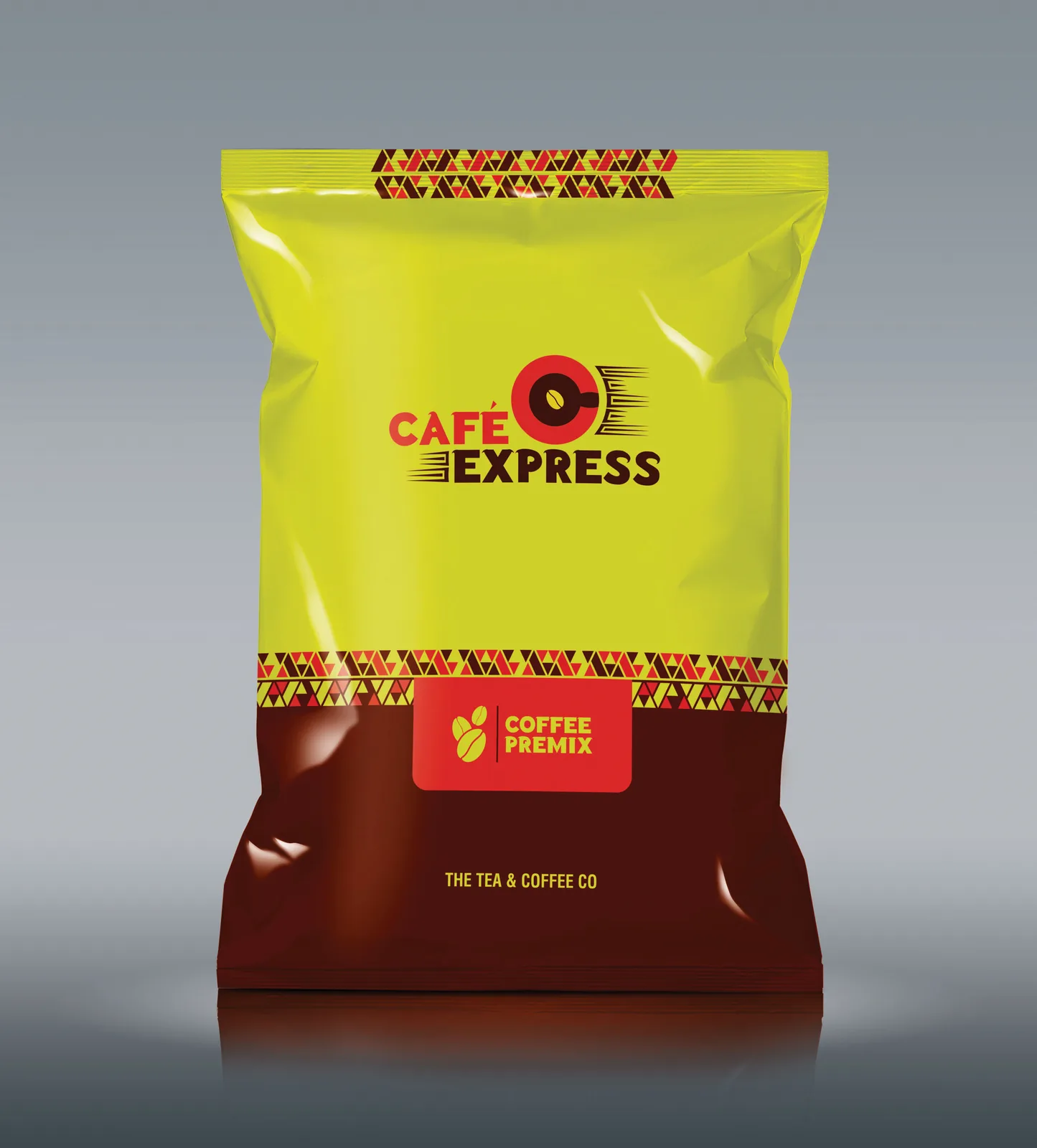
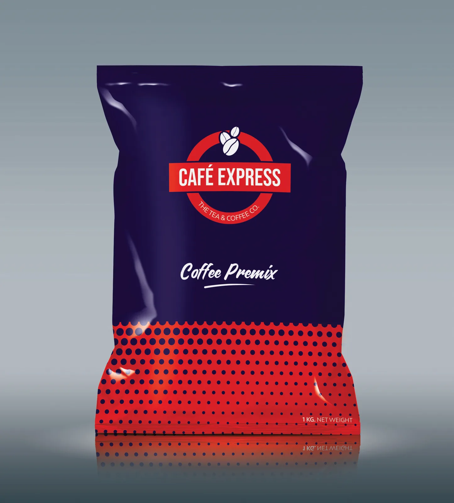
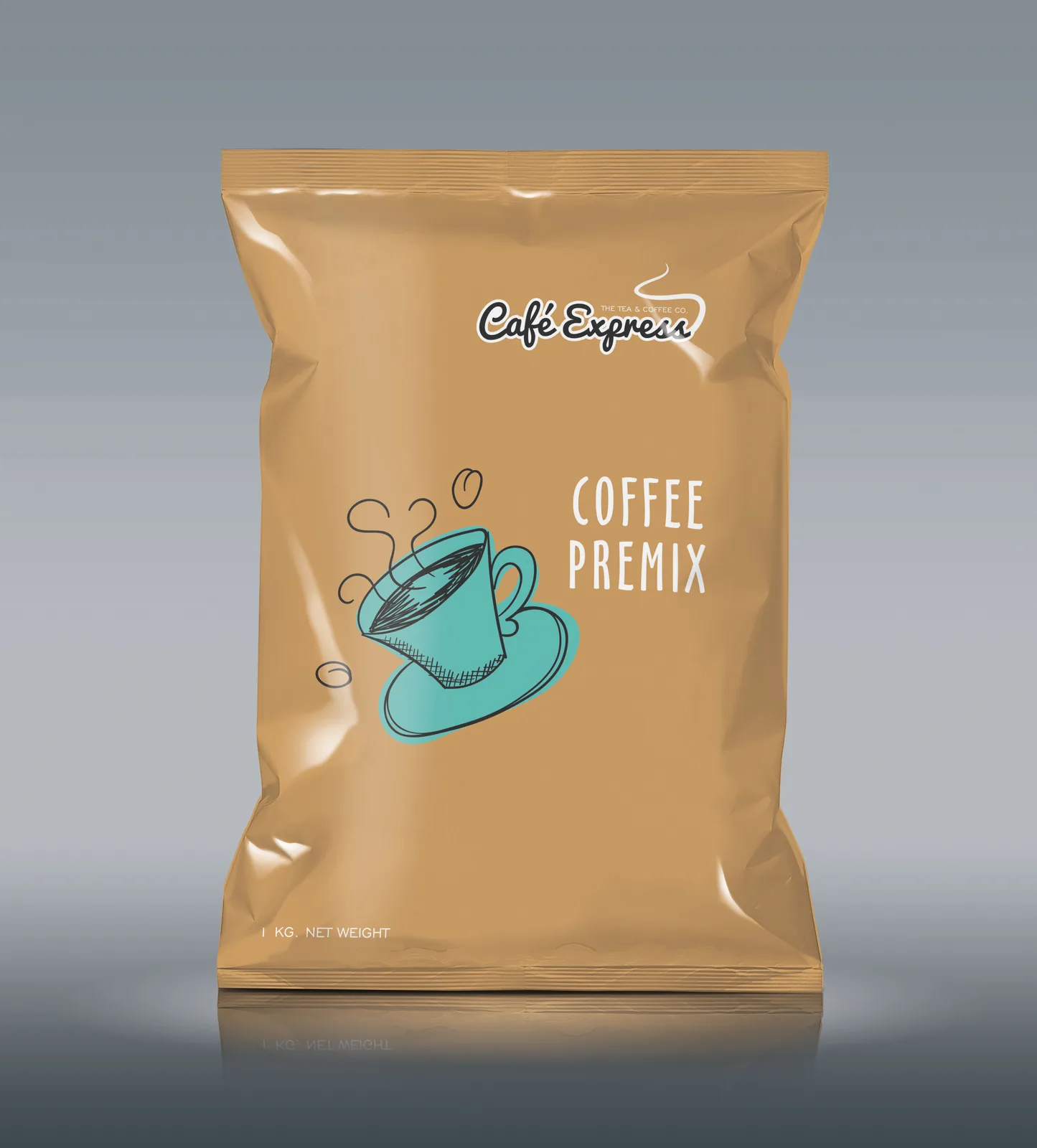
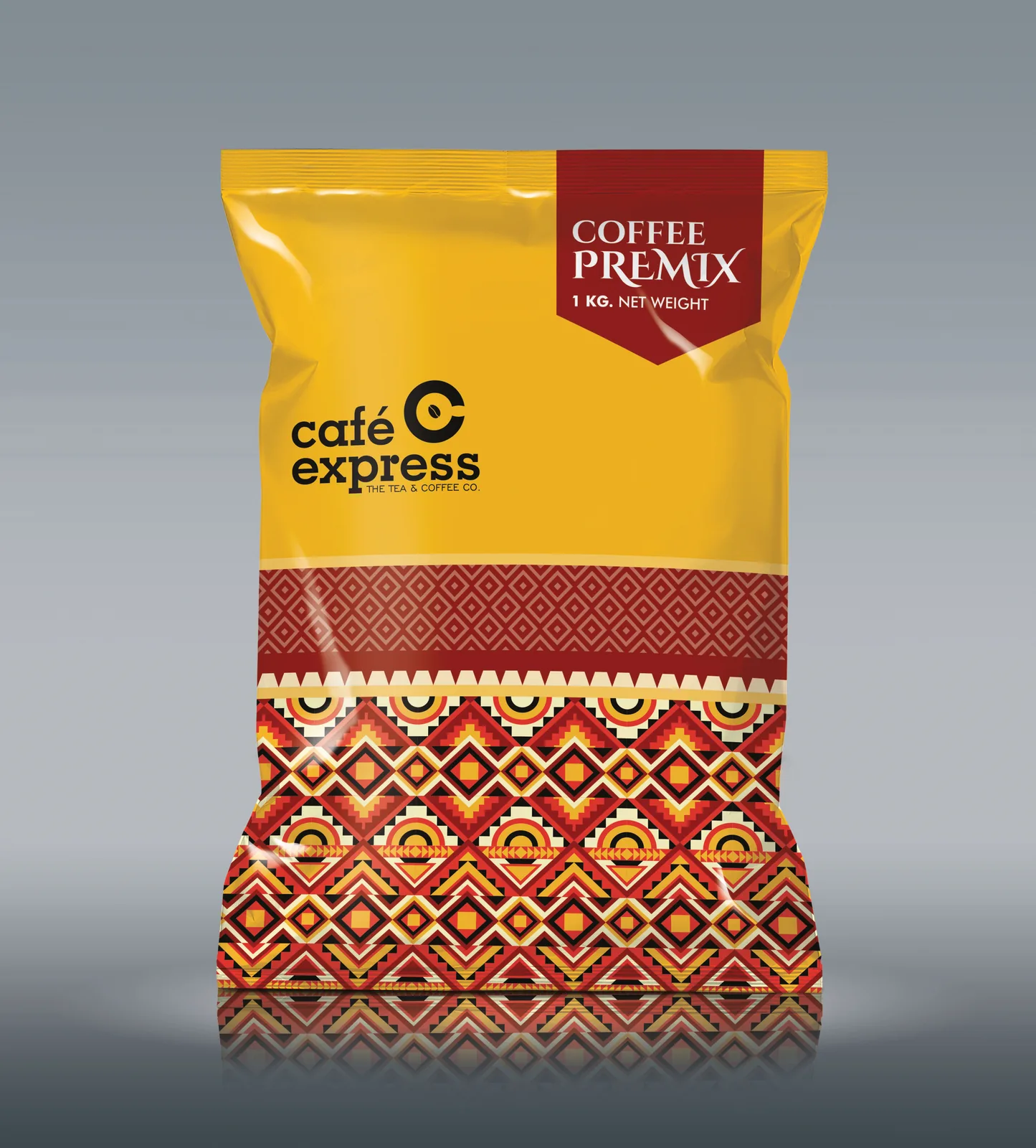
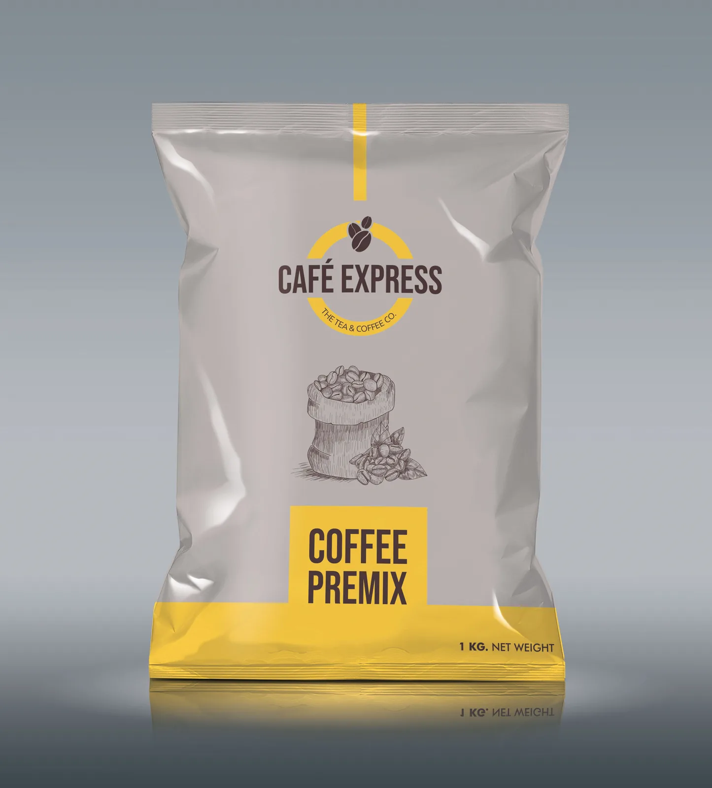
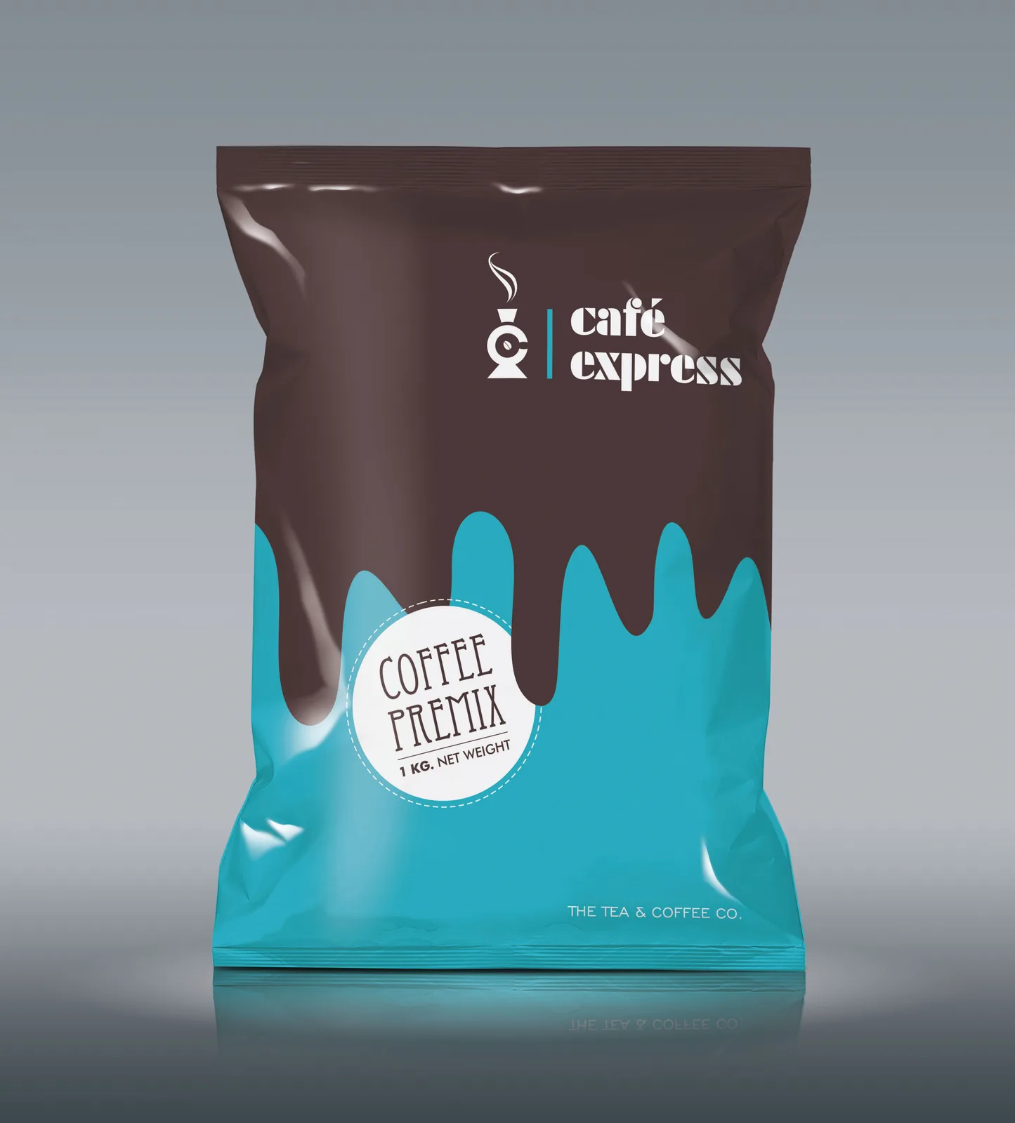
With the reason clear, we made the noise. We left the steaming cup behind. Instead, bold typography and confident colour carry the energy of the name, so the pack stands apart in an aisle full of the same picture.
Each blend has its own colour within one family, so a regular finds their pick without reading and a new shopper understands the range at a glance. Strength and taste notes sit in a simple, consistent spot on every pack. The design does the work aroma cannot do through plastic and foil.
The pack works twice. On a supermarket shelf, it holds its own from a distance. On Blinkit, Zepto and Instamart, the brand, blend and pack size stay legible at thumbnail size. FSSAI details follow one clean back panel system, and every SKU was seen through to print.
Project deliverables: What we built
- 01. Brand Positioning. Speed and character as the reason to choose, drawn from the name.
- 02. Packaging Design. A tea and coffee packaging design system that breaks the category picture.
- 03. Range Architecture. Colour coding by blend for instant navigation across the range.
- 04. Product Communication. Front of pack hierarchy and plain language back panel copy, FSSAI-ready.
- 05. Quick Commerce Assets. Thumbnail-first pack fronts for delivery apps and ecommerce listings.
- 06. Print Production. Press-ready artwork, seen through to the finished pack.
The outcome: The proof
A cup people reach for first.
The market tells us if it worked. Cafe Express now reads as one brand across every blend and pack size, from the shelf to the phone screen. The name and the pack finally say the same thing, and the range has a system ready for whatever brews next.
Every choice on the pack earns its place: the type, the colour, the order of the words.
Pretty is easy. Picked is the job.
Good brew, quiet shelf? One page. Straight answers. No obligation.
Get your free brand diagnosis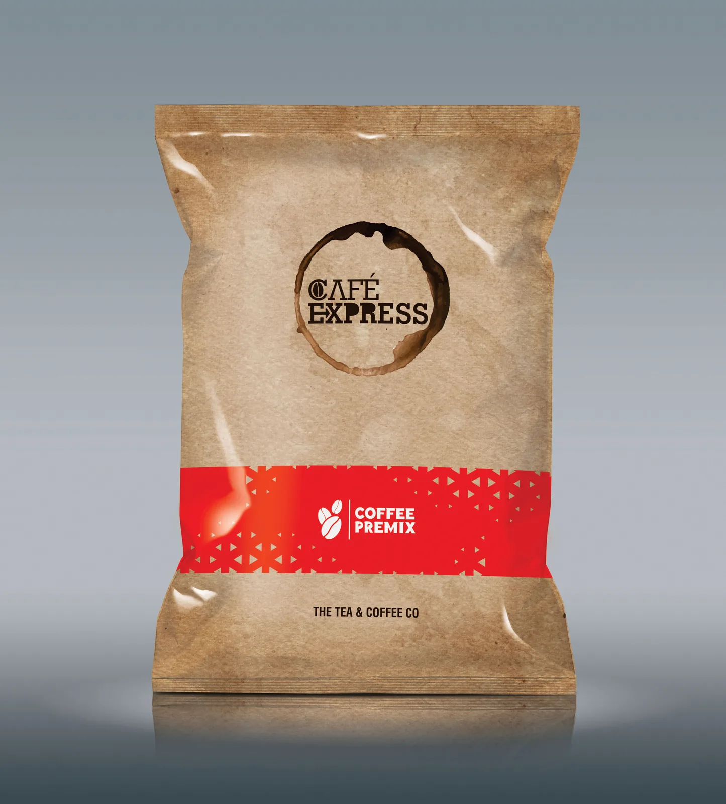
Next Project
Halani Foods