

Halani Foods
Bakery packaging design for Halani Foods by Nu.sense Brand Lab, Vadodara
Bakery
- Packaging
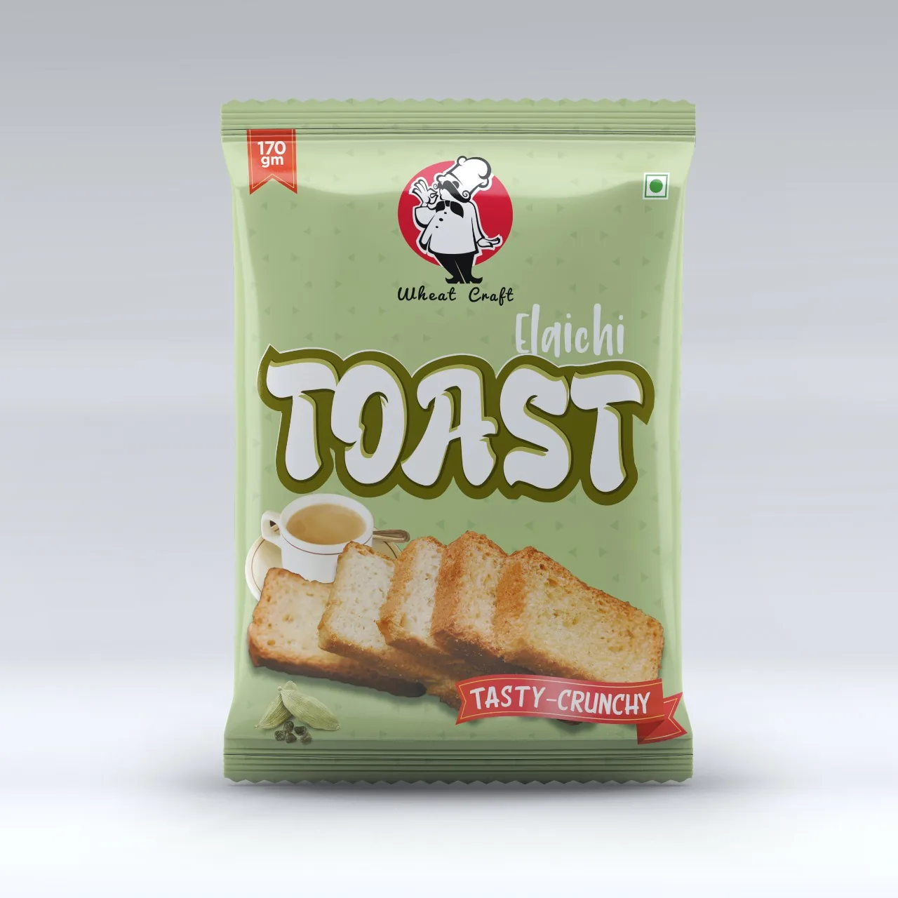
Case Study · Halani Foods · Bakery
Baked today. Picked today.
Halani Foods bakes with the care of a neighbourhood oven. We gave that care one clear reason to be chosen, then built packaging that carries the warmth of the bakery counter onto every shelf.
Brand Positioning · Packaging Design · Range Architecture
The context and the problem
Fresh is a feeling. Most packs forget it.
A sealed pack can't smell like an oven.
At a bakery counter, the choice makes itself. You see the golden edges, you smell the butter, you point. On a shelf, all of that is gone. Rusks, cookies and toast sit in plastic, and most packs look as if a machine made them.
That is the bakery category's quiet problem. Shoppers want something made with care, but the pack in front of them says factory.
Halani Foods came to our branding agency in Vadodara with products that taste like they came from a family kitchen. The packaging wasn't telling that story. On the shelf and on quick commerce apps, a warm product was reading cold.
The strategy: Make Sense
Bring the counter to the shelf.
Most brand problems aren't logo problems. Before we designed a single pack, we read the category, the customer and the competition, and asked what a shopper loses when bread leaves the bakery.
The answer was warmth. So the reason to choose Halani became simple: baked with care, and you can see it.
Every pack had to feel handed over, not shipped out. A shopper decides in half a second, so we set one order across the range: brand, product, the promise of freshness. Everything else moves to where it is needed, not where it shouts.
Not different for show. Different because sameness doesn't sell.
Halani. Straight from the oven.
Packaging: Make Noise
Half a second. Still warm.
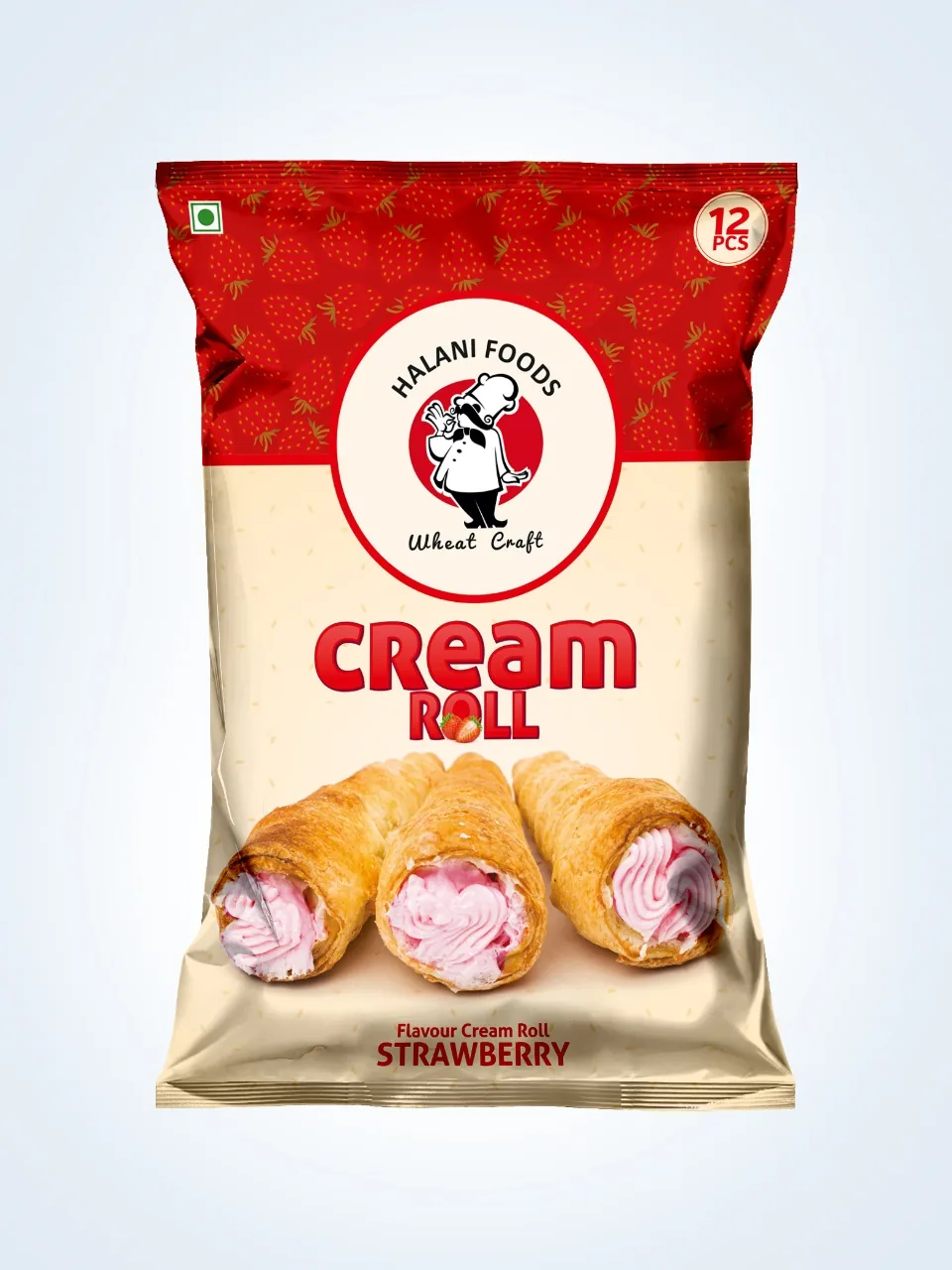
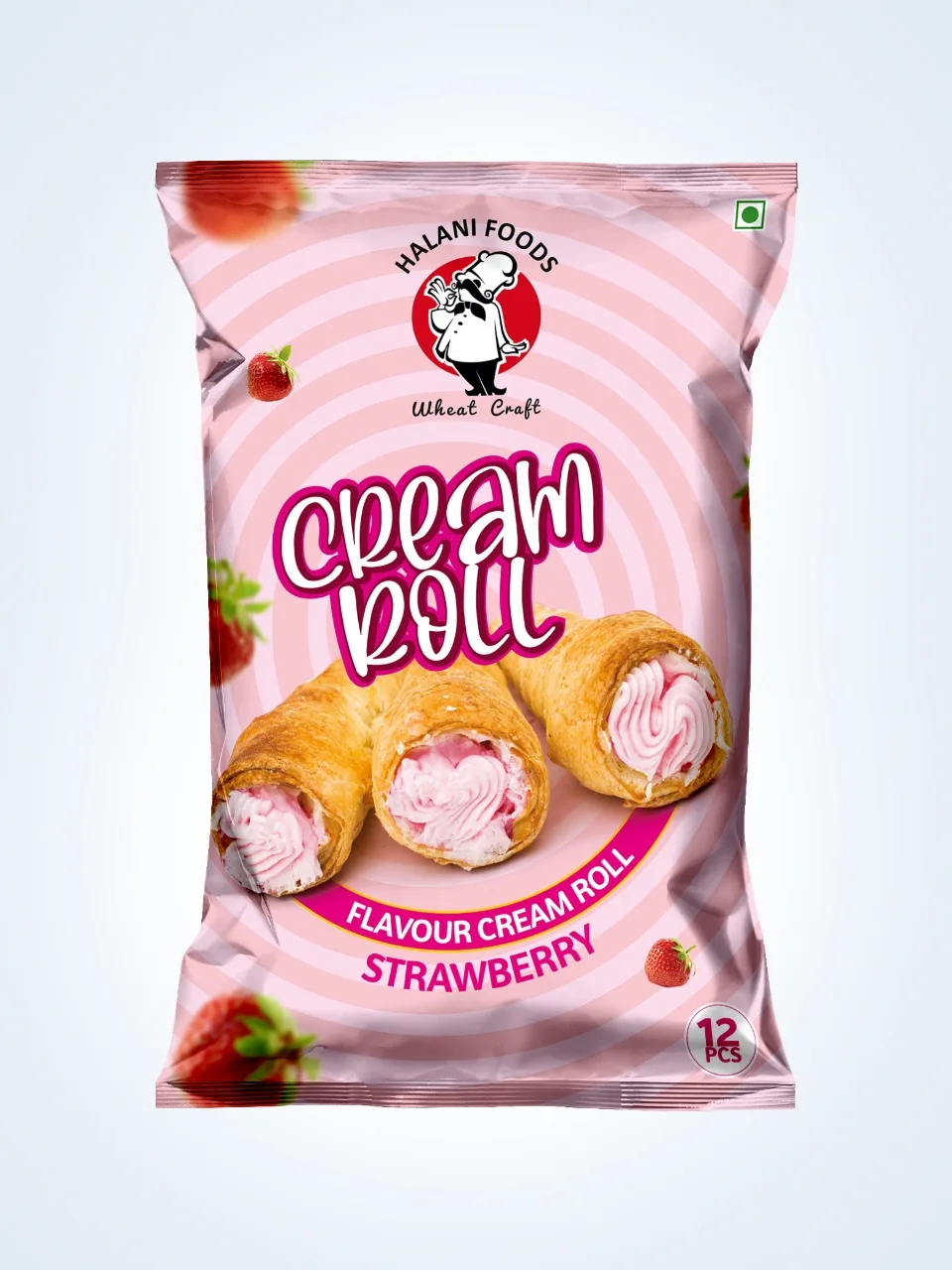
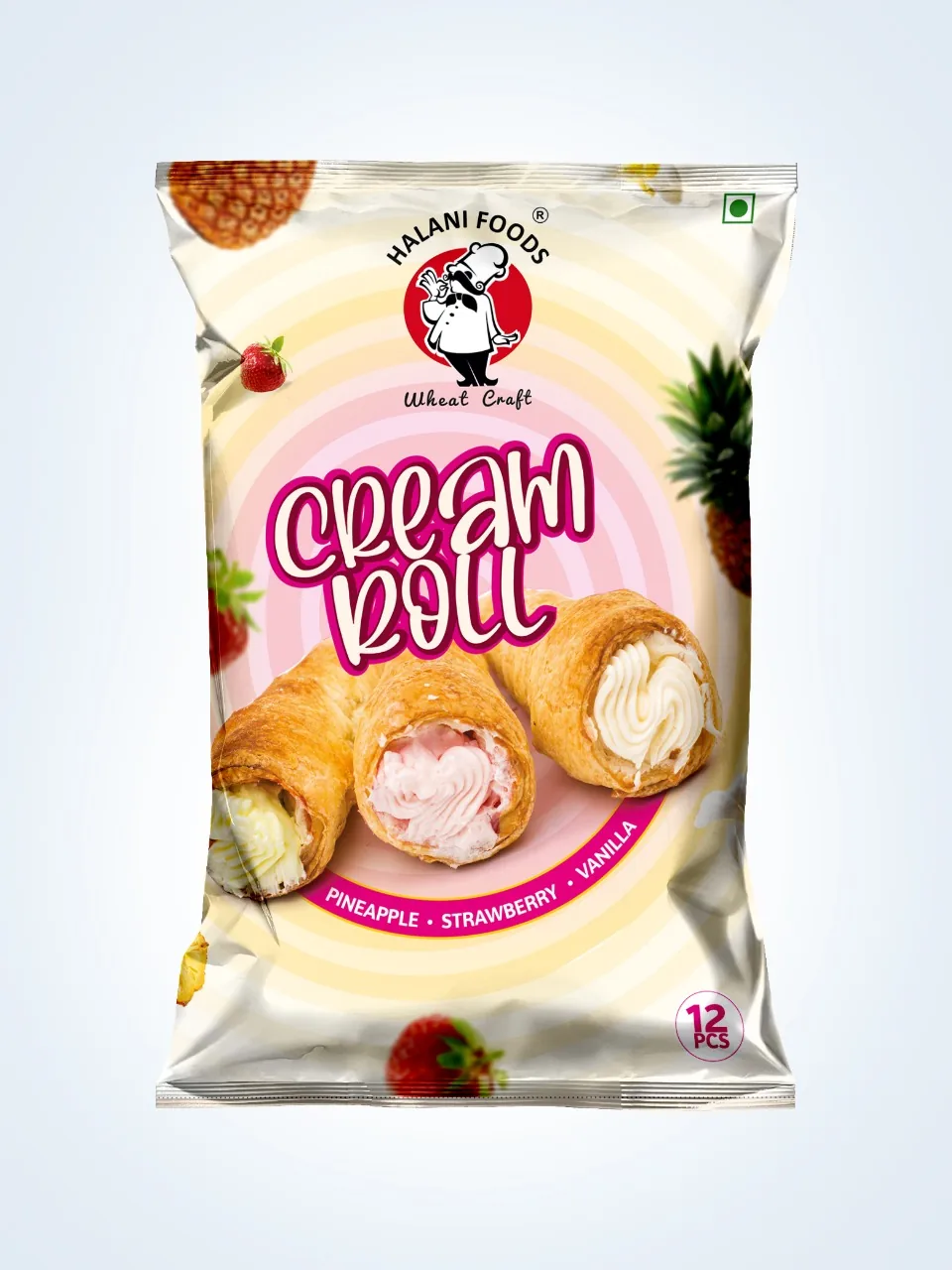
With the reason clear, we made the noise. Warm, golden tones replace the cold whites of the aisle. Honest product photography shows texture up close, the crumb and the crisp edge, so appetite does the selling.
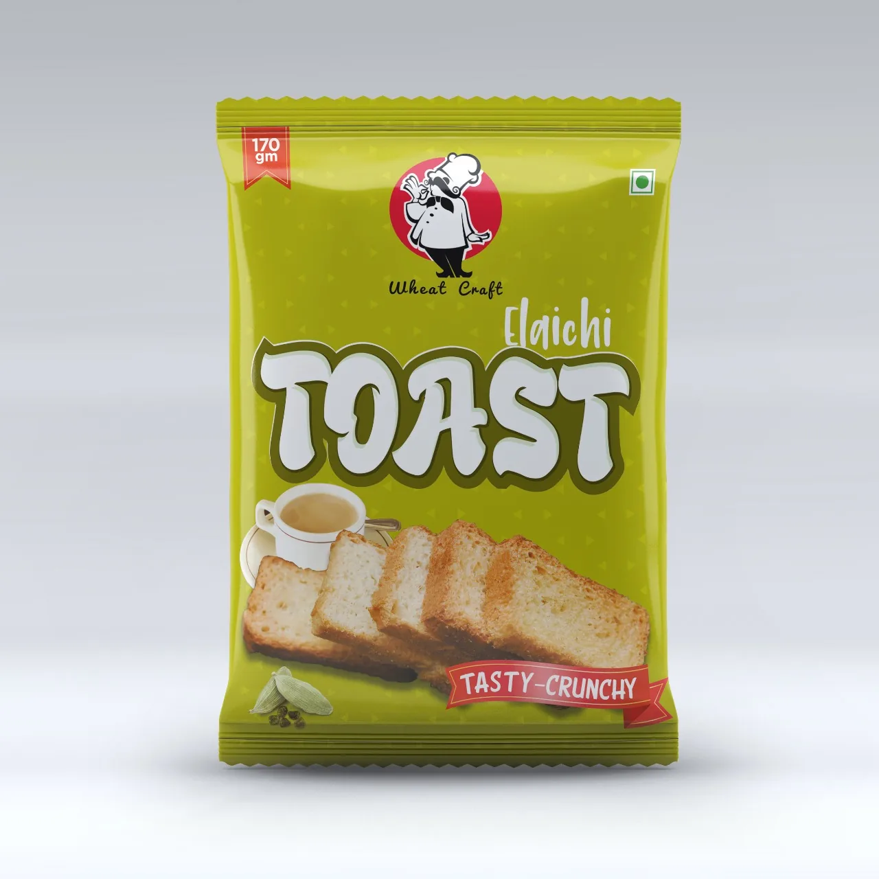
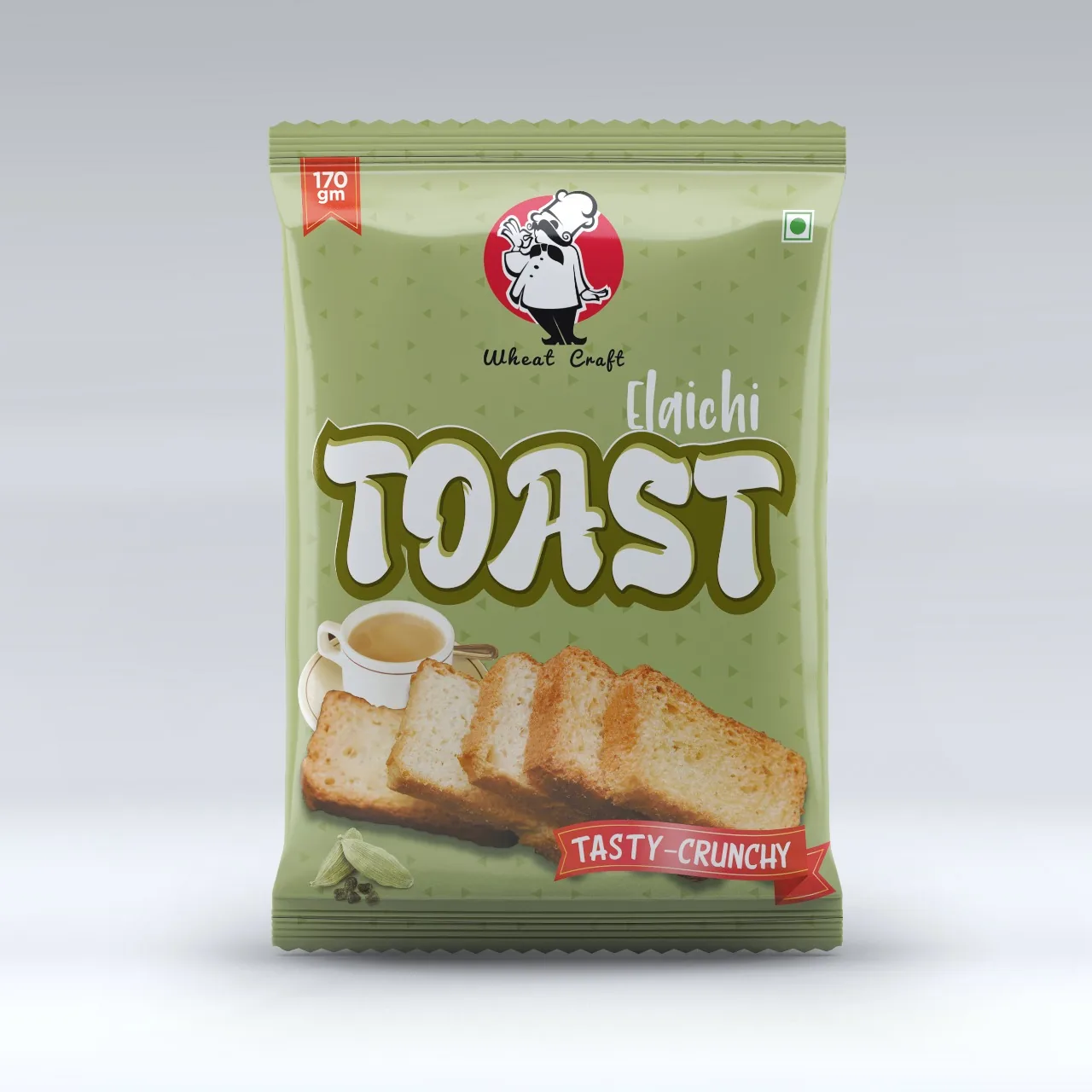
The bakery packaging design follows one family look across every product, with its own colour for each line, so a regular finds their rusk or cookie without reading and a new shopper understands the range at once. Type is friendly and confident, closer to a bakery signboard than a factory label.
The pack works twice. On a crowded kirana or supermarket shelf, it holds its own from a distance. On Blinkit, Zepto and Instamart, the brand and product name stay legible at thumbnail size. FSSAI details follow one clean back panel system, and every SKU was seen through to print.
Project deliverables: What we built
- 01. Brand Positioning. Care you can see as the reason to choose Halani.
- 02. Packaging Design. A bakery packaging design system that brings counter warmth to the shelf.
- 03. Range Architecture. One family look with colour coding by product line.
- 04. Product Communication. Front of pack hierarchy and plain language back panel copy, FSSAI-ready.
- 05. Quick Commerce Assets. Thumbnail-first pack fronts for delivery apps and ecommerce listings.
- 06. Print Production. Press-ready artwork, seen through to the finished pack.
The outcome: The proof
From the oven to the basket.
The market tells us if it worked. Halani Foods now reads as one bakery brand across every product, from the shelf to the phone screen. The taste and the pack finally say the same thing, and the range has a system ready for every new bake.
Every choice on the pack earns its place: the colour, the crumb, the order of the words.
Pretty is easy. Picked is the job.
Good bake, quiet shelf? One page. Straight answers. No obligation.
Get your free brand diagnosis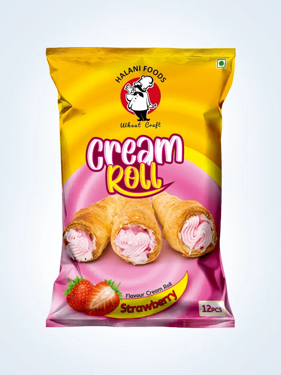
Next Project
Victor