
Amorya
Strategic brand identity and packaging design for Amorya baby care
Baby Care
- Identity
- Packaging
Case Study 01 · Amorya Baby Care
It's safe enough to be trusted by parents. It's different enough to be found.
We turned the promise of clinical effectiveness into a common visual language that gives today's parents a clear reason to choose Amorya both in retail and online.
Brand Strategy · Naming & Brand Identity · Packaging & Product Design
The Context & The Problem
Trust is non-negotiable. Camouflage is a luxury.
The baby care aisle is noisy, congested, and visually monotonous.
Most brands in the infant wellness category rely on the same washed out pastels and predictable visual motifs. When Amorya approached our branding agency in Vadodara, they brought a superior, scientifically formulated product line engineered for absolute infant safety. The challenge was structural. If a baby care product looks entirely clinical, it feels cold and unapproachable to a mother. If the product packaging for babies looks too clinical, then it will be cold and unfriendly to mothers. However, when the packaging is very playful, then parents become concerned about the safety of ingredients from the medicinal point of view. Amorya required a positioning solution to combine the two seamlessly.
The Strategy
Find the reason before designing the logo.
Creativity is expensive when you do not have the right strategy behind it. Overwhelmed parents do not read long list of claims on the back of the package in the first few seconds of purchase decision. All they need to know immediately is whether the product is pure and protective. Amorya was positioned as the ultimate combination of tender care and scientific rigor. We reduced visual elements to convey one thing that is necessary for a parent. This gave the customer one line that they could quote forever.
Identity & Packaging Architecture
Silent Salesman that Never Sleeps.
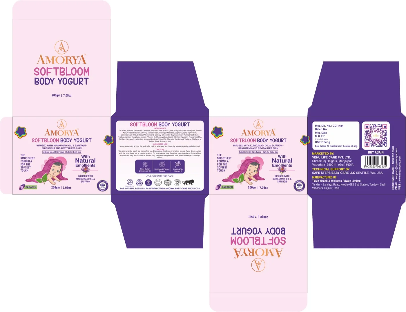
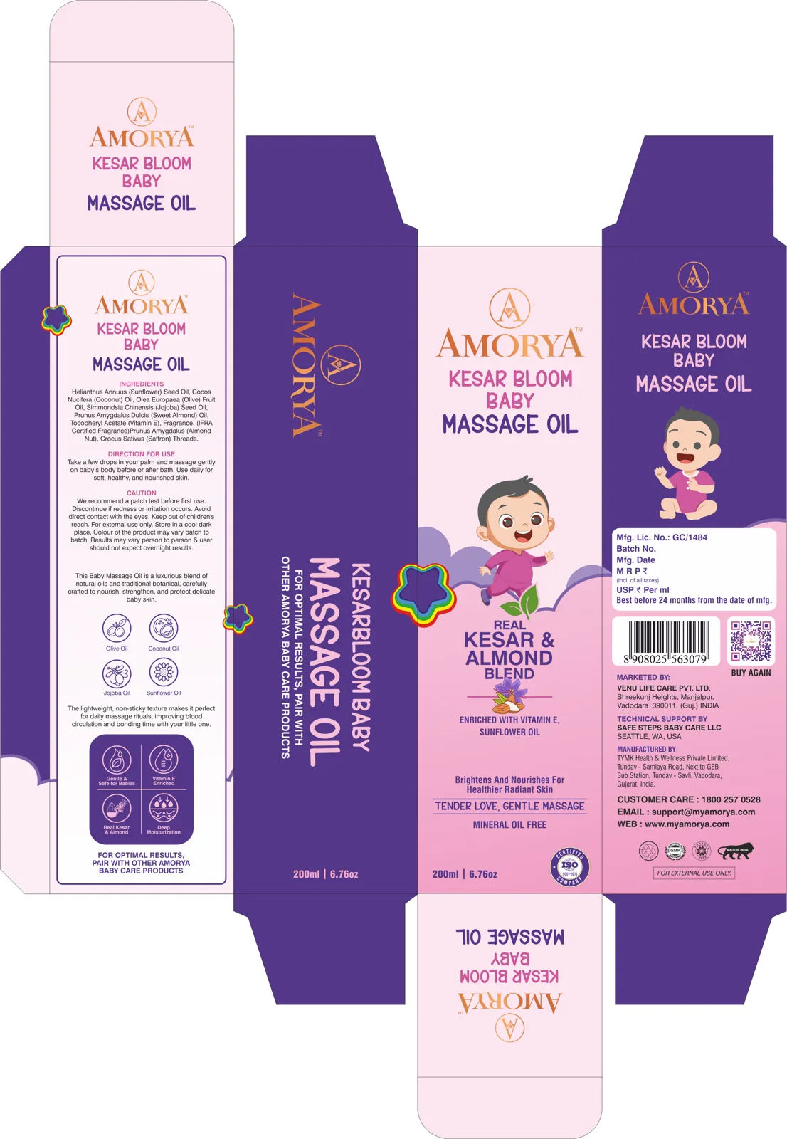
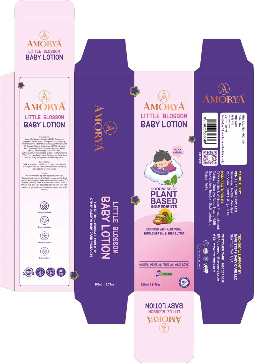
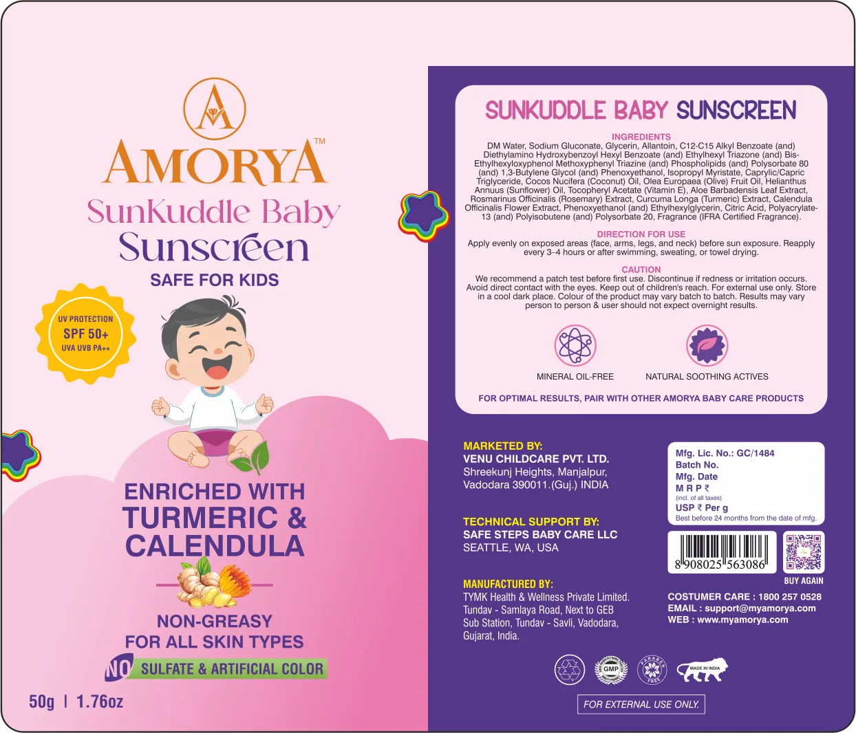
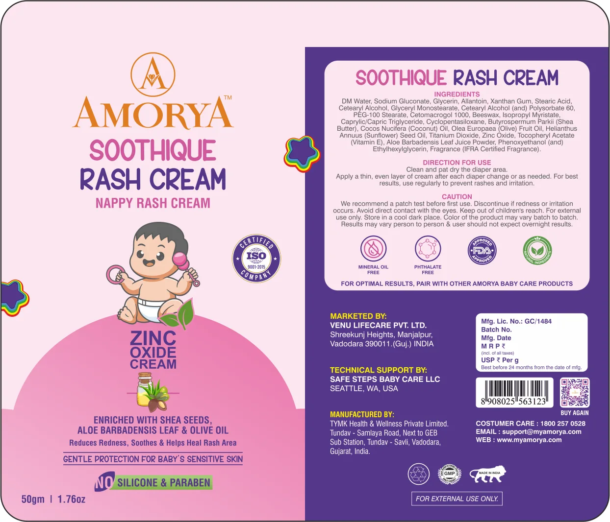
Once we were sure of the position, we created an Identity System that worked for the brand. To not fall into the trap of creating another templated look, we crafted a unique typography hierarchy that delivers safety of the clinical products with warmth and sophistication of the color palette. Since the packaging today has two very difficult tasks at the same time, the visual design is focused on high contrast visuals. The packaging layout is cut right through the retail clutter on supermarket shelves. At the same time, the fast commerce thumb nail packaging design is adjusted so the name of variants and claims about safety are readable on mobile screens via apps such as Blinkit and Zepto.
Project Deliverables
- 01. Core Brand Positioning. Developed the competitive positioning strategy, weighing the safety of medical care against maternal warmth.
- 02. Visual Identity System. Created a custom-designed primary logo mark system, color palette, and typography guidelines.
- 03. FMCG Packaging Design. Engineered structural packaging and high contrast label design for physical retail dominance.
- 04. Quick Commerce Architecture. Designed mobile first thumbnail packaging optimized specifically for digital grids.
- 05. Master Brand Guidelines. Created a design guide for maintaining consistency in future consumer contact points.
The Outcome
From clinical formula to household staple.
It either worked or it did not. In light of the master brand launch, Amorya was immediately getting noticed on all brick and mortar retail racks and fast becoming adopted through all digital distribution channels. The seamless 360-degree ecosystem helped raise their market value. Through positioning that met stringent design standards, Nu.sense Brand Lab transformed a challenge into a leader in its category.
Ready to build a brand that commands the market? Direct access to senior creative strategists. Initial response within 24 hours.
Get your free brand diagnosis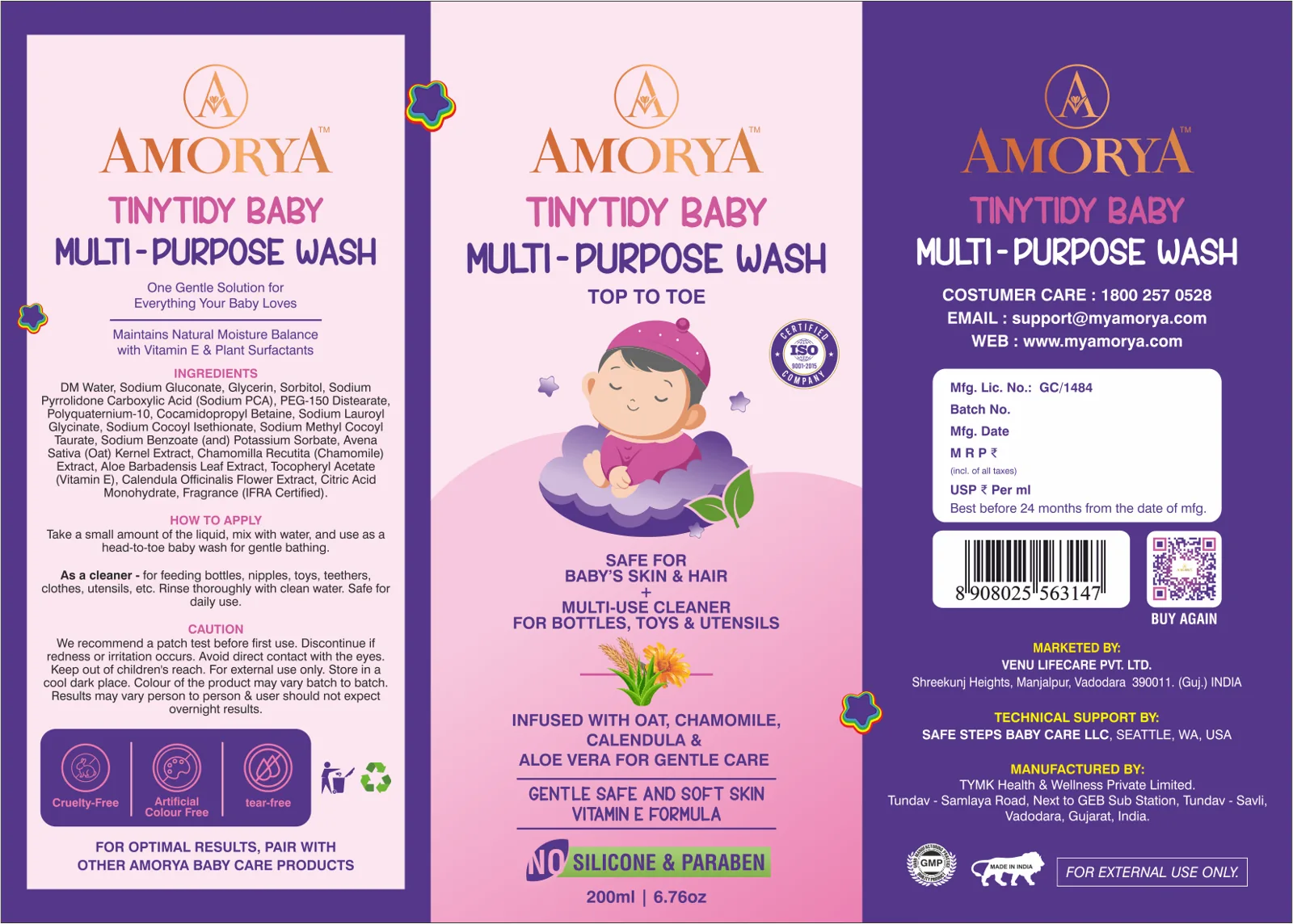
Next Project
Hira Hing