
Hira Hing
Strategic packaging and brand identity design for Hira Hing by National Foods
FMCG / Food
- Brand System
- Retail
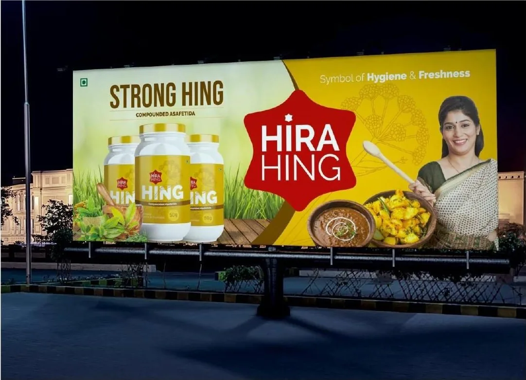
- Outdoor
Case Study 02 · FMCG & Retail
Preserving Legacy. Commanding the Modern Shelf.
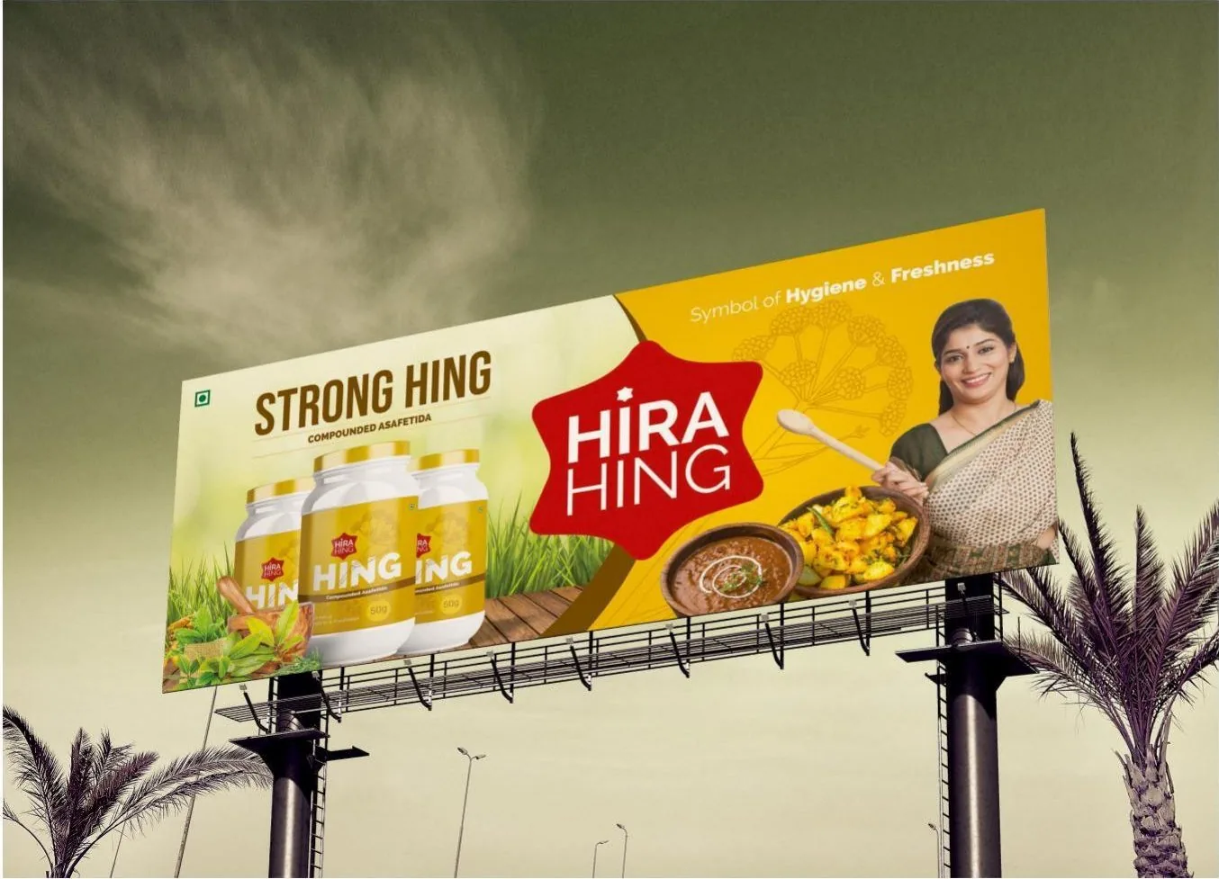
We revitalized the decades-old visual identity of Hira Hing, engineering a high-impact packaging architecture that retains traditional consumer trust while dominating physical retail and quick-commerce environments.
The Challenge
Legacy brands face a modernization trap.
- Context. Hira Hing (established in 1970) possesses immense regional trust and unmatched product purity. However, traditional spice packaging often blends into cluttered retail aisles and underperforms on digital delivery app thumbnails.
- The Objective. Modernize the brand architecture for high visibility and premium positioning without alienating a loyal, multi-generational customer base.
The Strategy & Execution
Anchoring on authenticity, engineered for contrast.
- Strategic Shift. Purity is the ultimate premium. We stripped away chaotic traditional design motifs, introducing disciplined typography and strong color blocking to reflect the 100% natural, chemical-free reality of the product.
- Execution Pillars
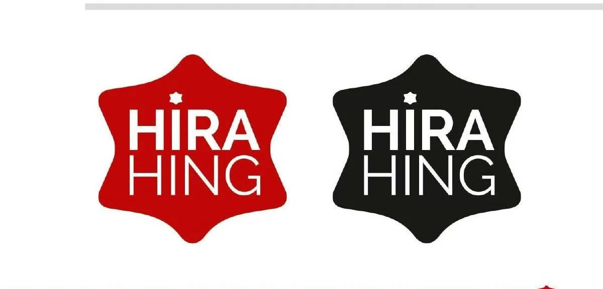
- Identity Refresh. Crafted a modernized logo mark that maintains historical recognition but scales cleanly across all touchpoints.
- Retail Packaging. Developed structural design and distinct color-coding for standard retail jars (10g to 200g) and commercial bulk trays (10kg).
- Digital Optimization. Ensured primary product identifiers (brand name, variant, purity claims) possess maximum legibility at micro-thumbnail sizes for rapid-delivery platforms.
Deliverables & Impact
- Deliverables List
- FMCG Brand Strategy & Repositioning
- Visual Identity & Logo Modernization
- Consumer & Bulk Packaging Design
- Print Production & Pre-Press Management
- The Outcome. The redesigned packaging system retained core generational loyalty while dramatically improving physical shelf stand-out and accelerating digital acquisition. The cohesive identity elevated Hira Hing's perceived market value from a regional staple to a premium national contender.
Next Project
Nyalkaran Pharma