

Vrundavan Bliss
Real Estate
- Exhibition
Case Study · Vrundavan Bliss · Exhibition
A hall full of skylines. One stall that felt like home.
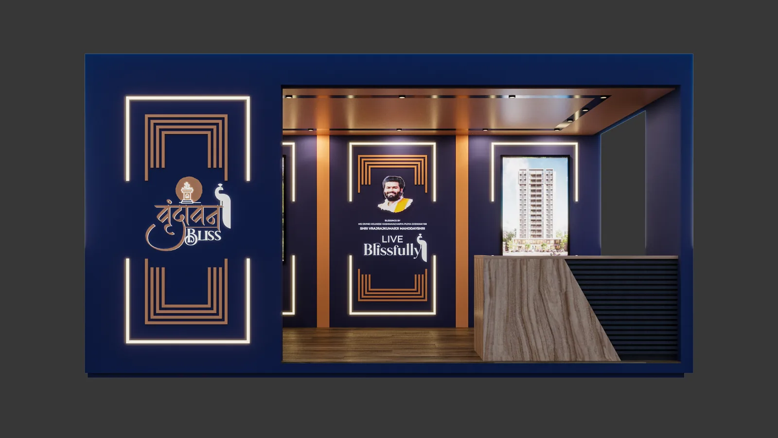
Vrundavan Bliss carries a name rooted in culture, warmth and togetherness. We built an expo stall that kept that promise, giving families a familiar place to pause in a hall of glass and steel.
Brand Story · Exhibition Stall Design · Spatial Experience
The context and the problem
Every stall promised world-class living. Nobody promised to feel like home.
The property expo has gone global. Families haven't.
Walk through a property expo today and you could be anywhere. Glass towers, steel frames, English names borrowed from far-off skylines. The language is all luxury, lifestyle and international amenities. It looks impressive. It also looks identical.
Yet the families walking those aisles often want something more personal. A modern home, yes, with every comfort. But also a place where festivals feel right, where grandparents feel at ease, where children grow up with the same warmth their parents did.
Vrundavan Bliss had a name that already spoke to that feeling. Vrundavan brings to mind gardens, devotion and a sense of belonging; bliss promises calm. When the project came to Nu.sense for its expo presence, the risk was clear. A standard glass-and-render stall would undo everything the name had promised before a visitor even stepped inside.
The strategy: Make Sense
Modern doesn't have to mean rootless.
We started with the families, not the floor plans. What do they feel is missing from the glossy towers around them? Over and over, it came back to belonging. People want progress without losing the warmth of the homes they grew up in.
That gave Vrundavan Bliss a clear and rare position in the hall. Not world-class living. Rooted living, the modern way. A place where contemporary comfort and familiar values sit together naturally, the way they do in the best Gujarati homes.
The stall had to prove that position in seconds, through feeling rather than claims. It needed to look unmistakably contemporary, so no one mistook it for old-fashioned. And it needed to feel instantly familiar, so every family recognised something of their own home in it.
The test was simple. Would a grandmother and her grandson both want to sit down?
Vrundavan Bliss. Modern living, with roots.
Exhibition stall: Make Noise
An aangan in the middle of the expo.
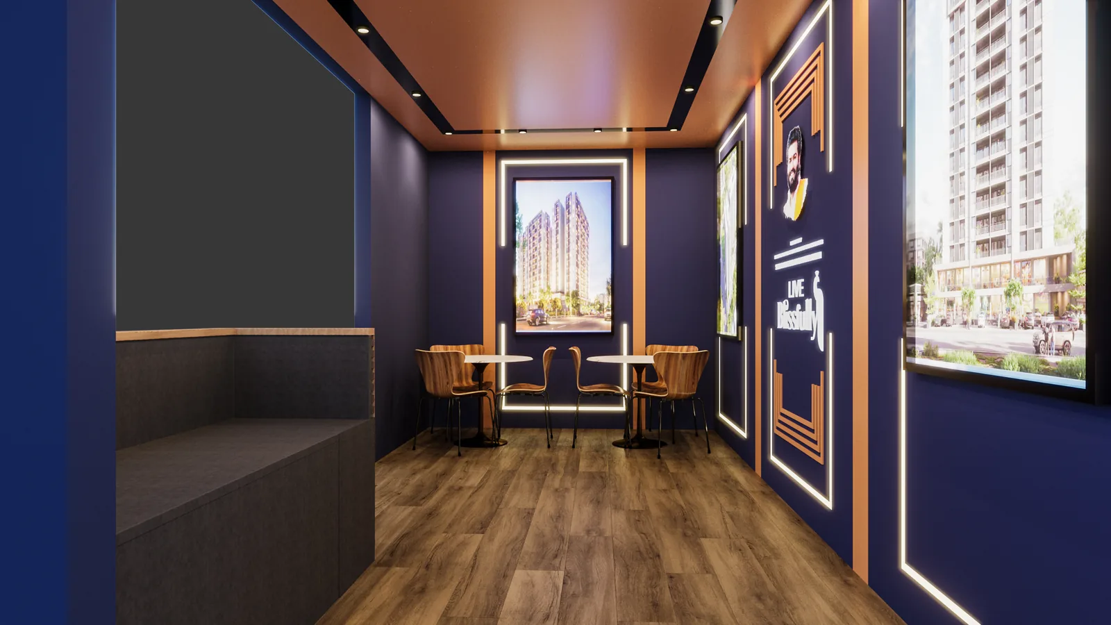
We designed the stall around the oldest gathering place in an Indian home: the aangan, the open courtyard where families sit, talk and celebrate. At its centre, an open seating area invites visitors to stop and settle rather than stand at a counter. A hichko, the traditional Gujarati swing, gives children and grandparents alike a reason to linger.
The edges speak the same language in a modern accent. Laser-cut jaali screens filter the hall's harsh light into soft patterns. A peacock and kadamb motif, drawn from the stories of Vrundavan and simplified into clean, contemporary lines, runs quietly across the surfaces. A warm palette of terracotta, natural wood and peacock blue sets the stall apart from the cold whites and greys around it.
Project information sits within reach but never in the way. Visitors meet the place first and the paperwork second, which is exactly how a home should be chosen.
Project deliverables: What we built
- 01. Brand Story. Rooted living, the modern way, belonging as the reason to choose.
- 02. Exhibition Stall Design. A courtyard-led stall built around the idea of the aangan.
- 03. Spatial Details. Contemporary jaali screens, a hichko and an open family seating area.
- 04. Motif and Palette. A simplified peacock and kadamb motif in terracotta, wood and peacock blue.
- 05. Stall Graphics. Project information placed within reach, never in the way.
- 06. Design to Build. Fabrication drawings and on-site coordination, seen through to the opening day.
The outcome: The proof
Families didn't just visit. They sat down.
Vrundavan Bliss gave the expo something it was missing: a place that felt familiar. Families stopped, settled and talked together, and the conversation with the sales team began from comfort rather than a pitch. The stall made the name's promise tangible before a single brochure changed hands.
A name sets an expectation. The space either keeps it or breaks it. This one kept it.
Make sense. Then make noise.
A name with meaning, a stall without it? Tell us what's not working. We reply with straight answers.
Get your free brand diagnosis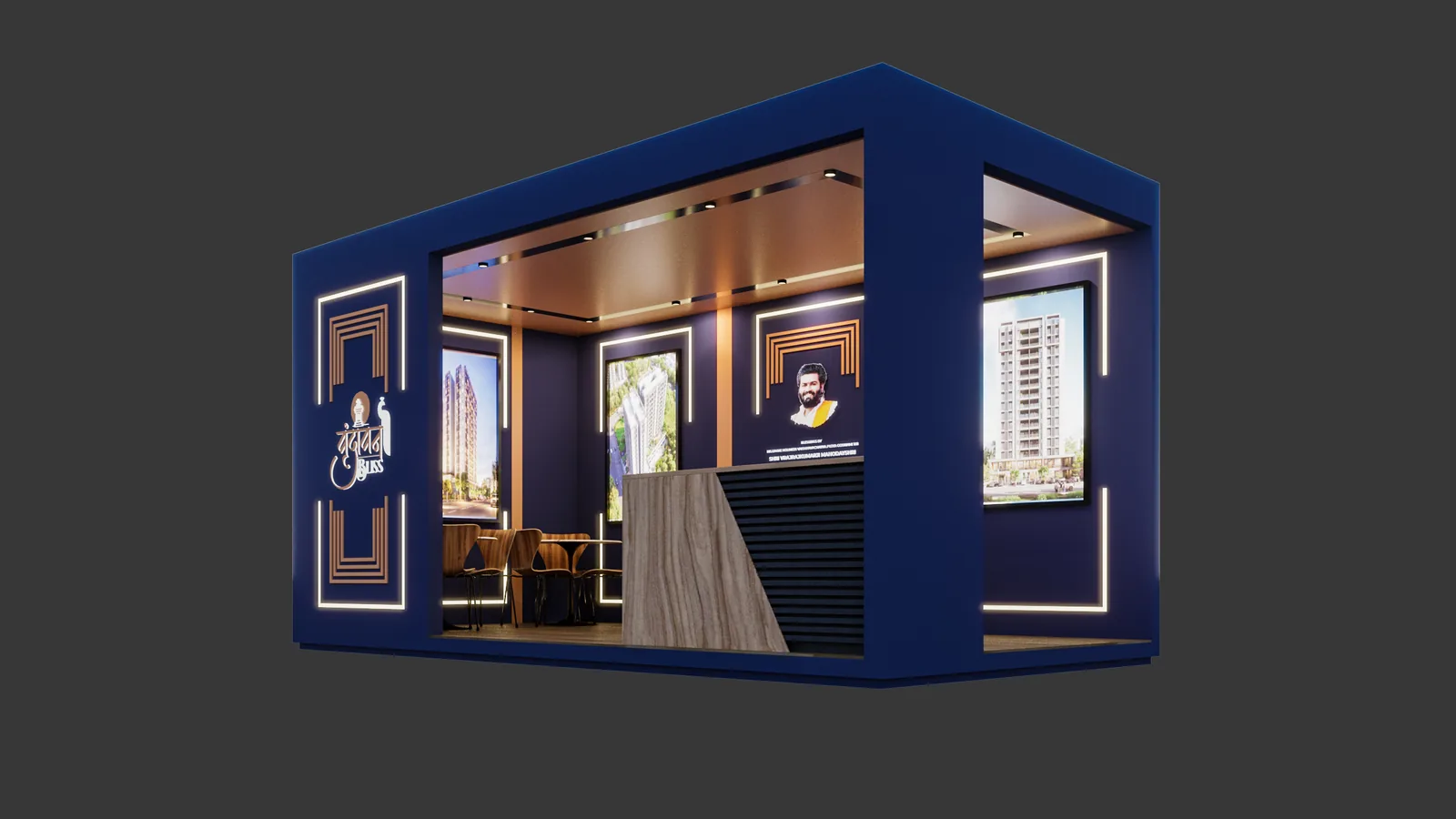
Next Project
Malhar Group