

Saral
Personal care packaging design for Saral by Nu.sense Brand Lab, Vadodara
Personal Care
- Packaging
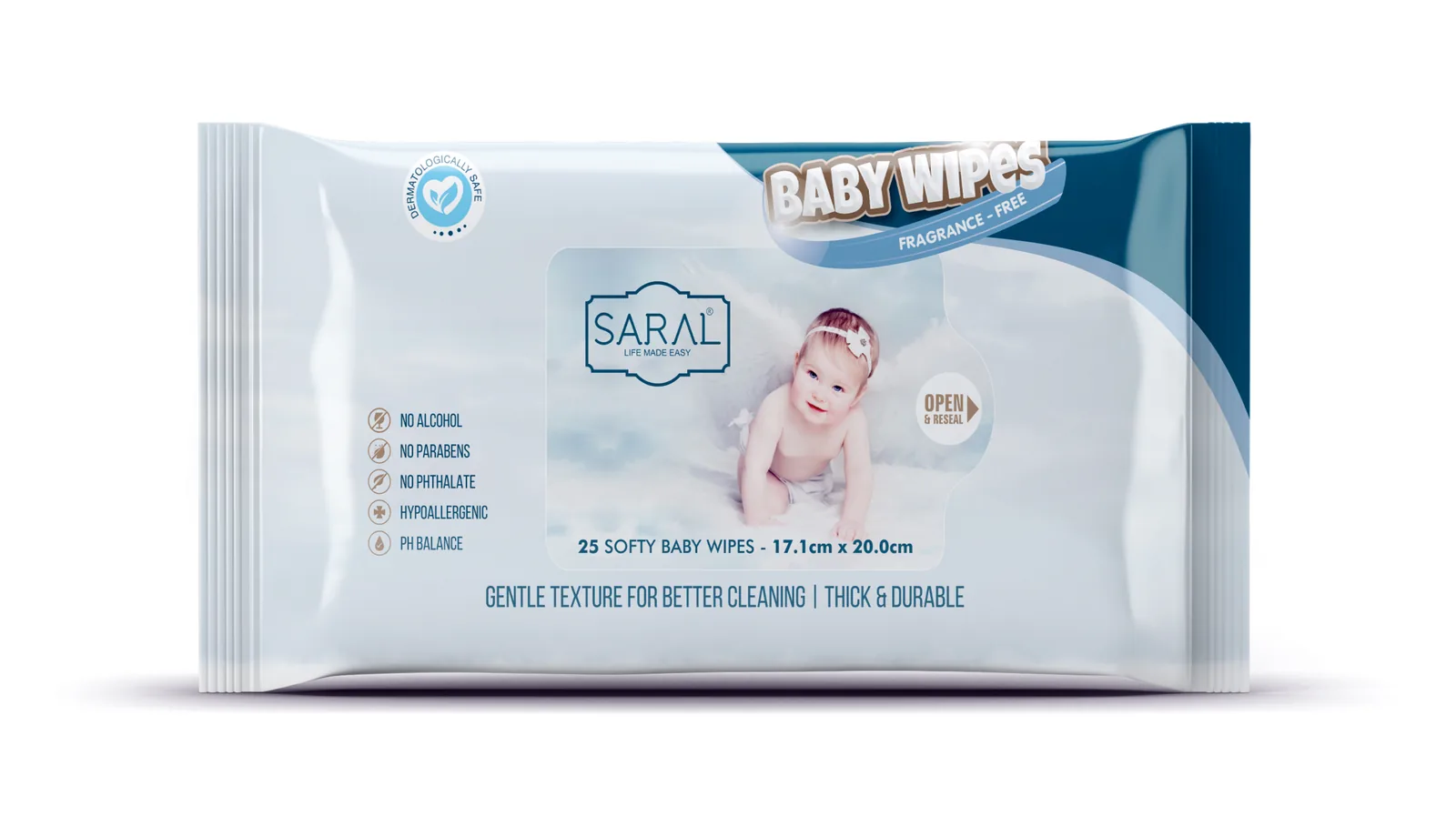
Case Study · Saral · Personal Care
Personal care, without the fine print.
Saral makes everyday care that does what it says. We built packaging just as honest: one product, one job, said in words anyone can understand at a glance.
Brand Positioning · Packaging Design · Product Communication
The context and the problem
The more a pack explains, the less a shopper understands.
The personal care aisle reads like a lab report.
Watch a shopper choose a face cream or a hair oil. They pick up a pack, turn it over, put it back. Then another. Fronts are crowded with percentages, actives and ten promises at once. Every product claims to do everything, so none of them clearly does one thing.
Confusion doesn't make people buy the cleverest product. It makes them buy the familiar one, or nothing at all.
Saral came to our branding agency in Vadodara with honest, effective everyday care. The formulas were simple by design. The packs, like the rest of the aisle, tried to sound scientific. A brand built on simplicity was hiding behind the same jargon as everyone else.
The strategy: Make Sense
Simple is the bravest promise in the aisle.
Saral means simple. Most brands would treat that as a mood. We treated it as a rule.
In a category competing on complexity, the real gap was clarity. Shoppers do not want a chemistry lesson. They want to know three things: what is this for, is it right for me, and can I trust it. Answer those cleanly and the choice makes itself.
So Saral took a stance the aisle was avoiding. Every product would do one clear job and say so in one plain line. No borrowed science. No stacked claims. If a benefit needed a paragraph to explain, it did not belong on the front.
Simplicity like this is harder than it looks. It means deciding what to leave out, and trusting the customer to value honesty over noise.
Saral. Care, kept simple.
Packaging: Make Noise
One pack. One job. One line.
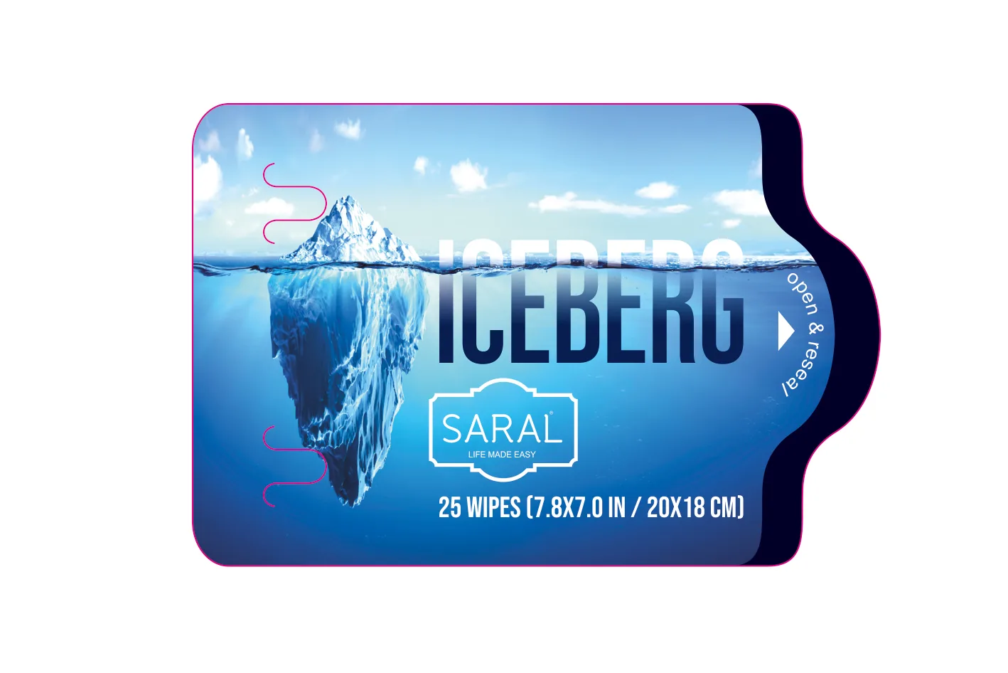
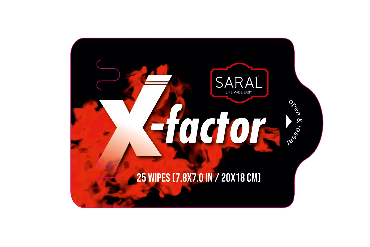
Here the words became the design. Each pack front carries just three things: the Saral name, the product, and a single line on what it does, written the way a trusted friend would say it. For dry skin, every day. For stronger roots. Short enough to read from arm's length.
Space does the rest. Where competitors fill every edge with claims, Saral's packs stay open and calm, so the one line has room to land. A soft palette with a colour for each need lets shoppers find the right product for their skin or hair without studying the shelf.
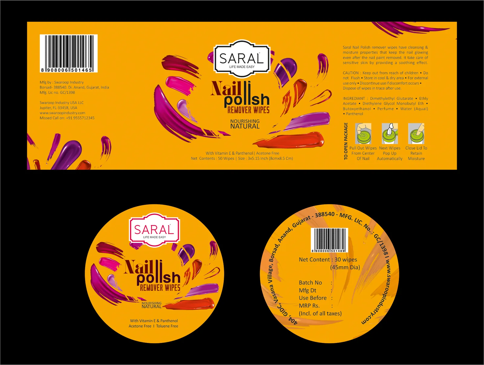
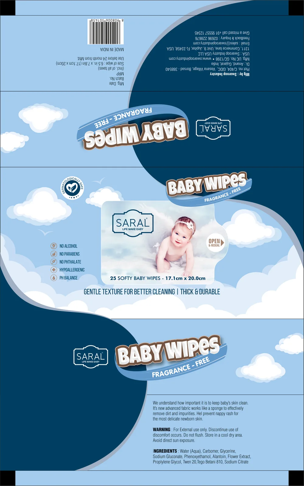
The detail still matters, so it moves to the back panel, ordered and readable for anyone who wants it. Across soaps, oils and creams, the same family look holds the range together. On ecommerce listings, the one-line benefit stays legible in the product image, which is often where personal care is chosen now.
Project deliverables: What we built
- 01. Brand Positioning. Simplicity as a stance, one product and one clear job.
- 02. Packaging Design. A personal care packaging design system built on open space and calm.
- 03. Product Communication. One plain-language benefit line for every pack front, with ordered back panel copy.
- 04. Range Architecture. Colour by need across skin and hair care, within one family look.
- 05. Ecommerce Assets. Product images where the benefit line stays readable on screen.
- 06. Print Production. Press-ready artwork across bottles, tubes and cartons, seen through to the finished pack.
The outcome: The proof
Easier to understand. Easier to choose.
Saral now stands out by doing what the aisle stopped doing: speaking plainly. Shoppers know what each product is for in a single read, and the range feels like one honest brand from the store shelf to the phone screen.
In a category that keeps adding words, the brand that says less is the one people hear.
Make sense. Then make noise.
Honest product, confusing pack? Tell us what's not working. We reply with straight answers.
Get your free brand diagnosis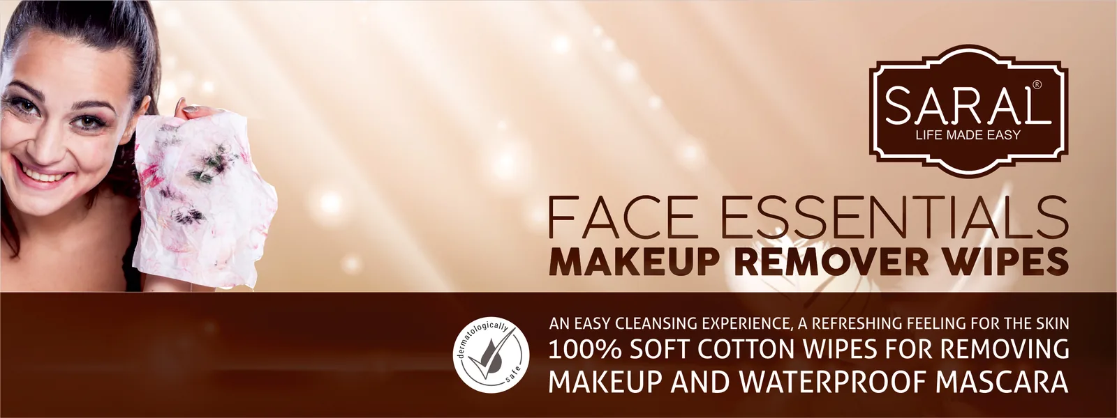
Next Project
RA Foundation